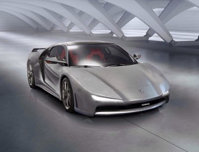
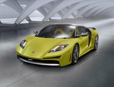
NSX 2.0 Body Kit

Quoting vf2ss:

The NSX 1.0 actually did this "overall" branding thing when it first came out...no "NSX" model name was even on the back or front, no "A" emblem on the back or sides...just one "A" emblem on the front and two "NSX" emblems on the side and "Acura" one the wheelcaps and tail center. Their grill did not match the style of any other car they had made before, their headlights did not match the style any other car they had made before, their parking lights did not match the style of any other car they had made before, their wedge front bumper did not match the style of any car they had made before, etc. Yet everybody that mattered to its success in the car world knew "ACURA NSX".

In contrast, the NSX 2.0 headlights (now DOT approved with amber marker and barbed design) now just look like the TSX, MDX, RDX, etc. headlight. The front beak (although now scaled back) just looks like the TSX, MDX, RDX, TL, RL, ILX, etc. front beak. One can argue that that was the point, but it is just my opinion that this consequently actually affected the design of the front of the 2.0 in a negative way because it actually forced them to have to hold back because they had created these design parameters...something the 1.0 was never subjected to. It was totally possible for them to stick with the tiny slit headlights that were so slick on the concept and looked so aggressive.

Again, some will say that was the point and from a design stand point I get that but there's more to it than that to make a prestigious brand. I just think that it would have been better for the purpose of focusing on their target market's prestige factor (for all we really know is that they have $160,000+ to spend on a car) to not have strong noticeable resemblances to their TSX/MDX headlights, an RL/TL grills, etc. (like the 1.0 did not to its line up) and just delegated the brand affiliation quotient to the emblem and the bigger picture of how awesome the car's gonna be.
In this scenario, the beak and headlight pattern is not necessary on the halo so it can then have a look that is distinct and separate from the lineup; and ideally with more resemblance to the legendary 1.0 front for greater recognition and design heritage. Which ultimately would really allow the prestige buyer in this exclusive price range to be able to spend this kind of money and still really feel a cut above the rest vs. not feeling like (I did not say is like) that they had just spent 160 grand on an overpriced middle-class-looking luxury car.

vf2ss, I couldn't have said it better myself. The original NSX looked nothing like its' Acura siblings. It was made to LOOK like a supercar. It was an extraordinary HALO car that other Acuras were nowhere near it from a mechanical or design standpoint. It's technology was supposed to have the trickledown effect. All aluminum chassis, titanium connecting rods, electric power steering, etc... The new NSX, besides it's bespoke engine is almost backwards. Electric motors and SH-AWD already introduced by the RL. I agree with you about the new NSX looking a lot like the rest of the lineup, but I would even go a step further and say it's a squished Accord coupe just like the 911 is the squished beetle.

similarities1.jpg

similarities2.jpg

When you said nobody wants to spend a 160k on a car that looks half ass exotic, that struck a cord with me. Isn't it common sense to know that a customer who's gonna fork over 150k plus from a non exotic established brand is gonna expect nothing but a home run out of the park styling wise? No one is gonna say "Hey can't you tell from the beak and headlights it's a Honda?" They're gonna want to hear what's commonly asked of the first gen NSX when they see it: "What the f*** is that?" Is it a Ferrari, Lotus,?... No, it's an NSX"

My only gripe with the new NSX is the styling. I greatly dig the hybrid/internal combustion set-up. I wish you were in the corporate/future product meeting when the new NSX was a thought. Man only if someone with clout had the same sentiment.
 
Quoting vf2ss:

The NSX 1.0 actually did this "overall" branding thing when it first came out...no "NSX" model name was even on the back or front, no "A" emblem on the back or sides...just one "A" emblem on the front and two "NSX" emblems on the side and "Acura" one the wheelcaps and tail center. Their grill did not match the style of any other car they had made before, their headlights did not match the style any other car they had made before, their parking lights did not match the style of any other car they had made before, their wedge front bumper did not match the style of any car they had made before, etc. Yet everybody that mattered to its success in the car world knew "ACURA NSX".

In contrast, the NSX 2.0 headlights (now DOT approved with amber marker and barbed design) now just look like the TSX, MDX, RDX, etc. headlight. The front beak (although now scaled back) just looks like the TSX, MDX, RDX, TL, RL, ILX, etc. front beak. One can argue that that was the point, but it is just my opinion that this consequently actually affected the design of the front of the 2.0 in a negative way because it actually forced them to have to hold back because they had created these design parameters...something the 1.0 was never subjected to. It was totally possible for them to stick with the tiny slit headlights that were so slick on the concept and looked so aggressive.

Again, some will say that was the point and from a design stand point I get that but there's more to it than that to make a prestigious brand. I just think that it would have been better for the purpose of focusing on their target market's prestige factor (for all we really know is that they have $160,000+ to spend on a car) to not have strong noticeable resemblances to their TSX/MDX headlights, an RL/TL grills, etc. (like the 1.0 did not to its line up) and just delegated the brand affiliation quotient to the emblem and the bigger picture of how awesome the car's gonna be.
In this scenario, the beak and headlight pattern is not necessary on the halo so it can then have a look that is distinct and separate from the lineup; and ideally with more resemblance to the legendary 1.0 front for greater recognition and design heritage. Which ultimately would really allow the prestige buyer in this exclusive price range to be able to spend this kind of money and still really feel a cut above the rest vs. not feeling like (I did not say is like) that they had just spent 160 grand on an overpriced middle-class-looking luxury car.

vf2ss, I couldn't have said it better myself. The original NSX looked nothing like its' Acura siblings. It was made to LOOK like a supercar. It was an extraordinary HALO car that other Acuras were nowhere near it from a mechanical or design standpoint. It's technology was supposed to have the trickledown effect. All aluminum chassis, titanium connecting rods, electric power steering, etc... The new NSX, besides it's bespoke engine is almost backwards. Electric motors and SH-AWD already introduced by the RL. I agree with you about the new NSX looking a lot like the rest of the lineup, but I would even go a step further and say it's a squished Accord coupe just like the 911 is the squished beetle.

View attachment 120619

View attachment 120620

When you said nobody wants to spend a 160k on a car that looks half ass exotic, that struck a cord with me. Isn't it common sense to know that a customer who's gonna fork over 150k plus from a non exotic established brand is gonna expect nothing but a home run out of the park styling wise? No one is gonna say "Hey can't you tell from the beak and headlights it's a Honda?" They're gonna want to hear what's commonly asked of the first gen NSX when they see it: "What the f*** is that?" Is it a Ferrari, Lotus,?... No, it's an NSX"

My only gripe with the new NSX is the styling. I greatly dig the hybrid/internal combustion set-up. I wish you were in the corporate/future product meeting when the new NSX was a thought. Man only if someone with clout had the same sentiment.

I don't disagree with some of your points, but I can tell you as someone willing to spend $160K+ on this car, you won't find anything overly exotic looking at this price point. At 2X the price, it's a different ball game. At $160K+, an NSX buyer will get near hypercar performance at a fraction of the price. From strictly an aesthetic perspective, I, too, wish the design was a bit more dramatic and unique. But, as for a brand new concept out of the box, I think it's quite well done. The problem for designers is to appease all of us...which is damn near impossible to do. If they go a tad too far, then prospective buyers may shy away. A solid, widely covered design, is always a good way to go when rolling out a new product. IMHO, the risk is too great if the design is overtly polarizing.
 
I agree Glenn! In the Motor Trend artical the quote was "We didn't want anything on the NSX that was fluff or just extra garnish for the sake of looking cool." Unfortunately I must be the only one who buys a super car for it to look cool. Preformance is for the track; I would be driving to it to the valet. I am disappointed that heavy body modifications seem almost necessary for the 2.0 NSX.
 
Honestly though I'm glad to hear that many here love the 2.0 beak. I would not want to live in a world where everyone agreed with me and thought like I do.
Ditto. Even if just two people are thinking exactly alike then someone is truly not thinking.

The time and effort you have put into this thread has drawn me to "one inescapable conclusion" lol...You really hate it
Lol…good one spooler, never said “hate” tho, but yes, not a fan of the design direction and decisions regarding the face.

One of those directional influences might actually be something that Nspec pointed out earlier regarding Furai design come to think of it. Furai came out in 07-08 at the Detroit Auto Show and clearly made an impact. Not only did it get scaled back renditions in their regular lineup (like Mazda 3 posted earlier), it got licensed into all the mobile gaming releases of Asphalt 6,7,8, & GT and is considered exotic in appearance.

Mazda_Furai_Detroit_2008.JPG


Also in ’08 at the same show, the ASCC was introduced and was supposed to go on sale in 2010. Well soon after that within the year due to poor economic conditions ASCC was cancelled. This meant starting from the drawing board again. This next go’round having seen Furai’s “rippling” effect, perhaps…and this is immense conjecture, T. Minami, Chief Creative Director, who penned the new NSX may have been somewhat influenced by this seemingly up-and-coming style. Furai after all means “sound of the wind” in english which conceptually sounds really cool (almost spiritual) and looked like nothing really ever seen before. At any rate, the front of the new NSX although more rigid than Furai-organic I think bears some noticeable resemblance.

Again this is just a design direction/decision preference. To contrast, if you study the Top 10 Greatest Car Designers according to Jalopnik, it becomes apparent in their process that there is a very well established design principle that in order to establish a legacy, new automotive designs MUST keep something from past ones and synchronously create tradition and heritage in the process. This one principle I believe was highly neglected in their differing direction exploration of what Acura’s own site calls “interwoven dynamic exterior design”. “The new NSX is a product of what we term ‘Interwoven Dynamic’ design,” said Michelle Christensen, NSX exterior design project leader. “It represents the ideal blending of exotic sports car form and supercar function.” In their effort to push the envelope and explore a different design path, they’ve created a style they hope will catch on and pioneer a new design "rostrum". I'll just say this...when I do a quick Google Image search for “interwoven design” I see the new NSX smack dab in the middle of diamond rings, bracelets, necklaces, earrings, wicker baskets, bricks, quilts, pergo, rugs, hanging tapestries and so on. Perhaps not quite the design affiliation a supercar would long for if it could have its druthers.

interwoven_design.png


I would like to see and artist rendition of the original rear end of the 1st generation NSX "negative spaced spoiler".
DocS, just in case you hadn’t seen it yet Ted Klaus pointed out in a video @Detroit that there actually is a little bit of “negative spaced spoiler” action going back there to pay a mild tribute to the original’s drag coefficient. It was not in the early prototypes but rather a late-stage addition via further wind-tunnelling all the while under Christensen at this point. Sadly, this aerodynamic function is not as evident in appearance like the original…in Ted’s very own words, “air exiting out this almost invisible vent”.

vent.jpg


On a side note...that Ferrari FXXK you referenced I don’t know how else to put it is just jaw-dropping…

Ferrari-FXXK_side.jpg

Ferrari-FXXK_open.jpg


... I also think the front air dam is too big now too.
I tried several additional explorations for adding more “flesh” to the OEM front bumper. I cannot find anything that does not result in just more of the same line-up conventional-looking, tamed-supercar appearance (see example)…

further_front_alt1.jpg


The original NSX looked nothing like its' Acura siblings. It was made to LOOK like a supercar. It was an extraordinary HALO car that other Acuras were nowhere near it from a mechanical or design standpoint. It's technology was supposed to have the trickledown effect. The new NSX, besides it's bespoke engine is almost backwards. Electric motors and SH-AWD already introduced by the RL. I agree with you about the new NSX looking a lot like the rest of the lineup, but I would even go a step further and say it's a squished Accord coupe just like the 911 is the squished beetle.

Really excellent point about the trickle down effect from every aspect. On the flip side I was rather dismayed when I tested out your Honda Accord observation. In my mind, in no instance in time should your premier halo car ever be only just a few photoshop “puppet-warp” adjustments away from each other. Ugh.

similarities_back.jpg


similarities_side.jpg


...and double ugh.

When you said nobody wants to spend a 160k on a car that looks half ass exotic, that struck a cord with me. Isn't it common sense to know that a customer who's gonna fork over 150k plus from a non exotic established brand is gonna expect nothing but a home run out of the park styling wise? No one is gonna say "Hey can't you tell from the beak and headlights it's a Honda?" They're gonna want to hear what's commonly asked of the first gen NSX when they see it: "What the f*** is that?" Is it a Ferrari, Lotus,?... No, it's an NSX"

Yes, the name of the branding game is not just incredible performance but how well the overall “look” for said performance is executed especially in this specific case because of the established price point. Whether people like to admit it or not there is a hidden “prestige” factor for $160K that must be met in appearance alone so “out of the park” is spot on. You really can’t look like the rest of the flock in order to stand out. Think iconic the greatest rockstars/superstars (Presley, MJ, Madonna, Prince, Gaga, etc.) know how to play this card all the time. They are not just a few wardrobe adjustments away from Lawrence Welk if you get my drift.

…In the Motor Trend artical the quote was "We didn't want anything on the NSX that was fluff or just extra garnish for the sake of looking cool." Unfortunately I must be the only one who buys a super car for it to look cool. Preformance is for the track; I would be driving to it to the valet. I am disappointed that heavy body modifications seem almost necessary for the 2.0 NSX.

I agree. And I would argue that these kind of “sound good” design principles (no fluff, purist design philosophy, in every respect aero-dynamic, functionality in the truest form, etc.) ends up unintentionally restricting them with design constraints to follow all these “rules”. Look, something truly and completely aerodynamic can be ugly. So yes, make that ideal a goal to aim for, but it doesn’t have to become hard and fast “rules” which cannot be broken. The new NSX spoiler may be purely simplified down to its most irreducibly complex form, but the new Toyota FT-1’s reactive spoiler whether it’s pure or not is pretty dang cool. Now ask yourself which spoiler alone has better sales excitement potential?

<iframe width="560" height="315" src="https://www.youtube.com/embed/JEi8CwcgRkA?rel=0&controls=0&showinfo=0" frameborder="0" allowfullscreen=""></iframe>
http://youtu.be/JEi8CwcgRkA
 
Great summary Vf2ss!
The exsisting 2.0 paper thin spoiler is just plain and weak. I really like the way you put it- "Something truely aerodynamic can be ugly". I think the "high ups" use stament like i previously quoted as an excuse, which unfortunately, seems to be a theme...
I like toyota's enginering and uniqueness, but i am not a fan of moving spoiler's look.
 
Last edited:
My quick fix from vf2ss and spoolers NSX/HSC look....

I wish the new NSX looked more like this...

image.jpg
 

Attachments

  • image.jpg
    image.jpg
    94.7 KB · Views: 720
Last edited:
^^ VF will not approve

Lights must be visible now . HSC lights look oversized to me but fine.

This better though.... further smoothing the jagged edges of frt fender

Rounded edges and gradual curves more pleasing to look at IMO.

S
 

Attachments

  • y   3 2.jpg
    y 3 2.jpg
    61.6 KB · Views: 678
Last edited:
Ha. I think over the years a good chunk of 91-01 owners have at some point wished the technology existed to have made their combo lights their actual headlights (making the pop-ups optional). At least that's how I interpreted 91X's quick fix to be...the ultimate combo-light homage to the original w/out the need for pop-ups OR the blisters.

The resulting long hood effect kinda reminded me of the BMW Mille Miglia - another concept paying homage to the BMW 328 Brescia Grand Prix coupé which interestingly goes waaaay back to a pre-WWII racing heritage.
bmw_mille.jpg


I think the wide-open front bumper adjustment you did Spooler (very 458-ish) is much cleaner. But the side intakes going “beast mode” and get that aggressive is super cool and I hope one day a reality on a wide-body version.

- - - Updated - - -

woah, just saw your latest post...that does look good!
 
I tried several additional explorations for adding more “flesh” to the OEM front bumper. I cannot find anything that does not result in just more of the same line-up conventional-looking, tamed-supercar appearance (see example)…

I've seen a chop where the chrome bezel on the nose was body colored and it looked much better, but I can't find that pic up here now. The whole front would need some rework.

- - - Updated - - -

Here they are, by
attachment.php


attachment.php


attachment.php


- - - Updated - - -

By Spooler*
 
lol thanx but sucs..yellow car rules :biggrin:

I'm proud of that bumper Spec even if others may not care for it..drew it with my trackball !
 
Last edited:
^^ VF will not approve

Lights must be visible now . HSC lights look oversized to me but fine.

This better though.... further smoothing the jagged edges of frt fender
Rounded edges and gradual curves more pleasing to look at IMO.

S

Looking good!
 
...The whole front would need some rework.

attachment.php


I think you're right...

So here's an idea that keeps the oem blister openings on the hood, the gull wing slats just under the headlights (for Valk :wink: ) but adds an R-ish ducted hood vent (homage to the Type R) + front bumper...

nsx_bumper_kit.jpg
 
Last edited:
I think you're right...

So here's an idea that keeps the oem blister openings on the hood, the gull wing slats just under the headlights (for Valk :wink: ) but adds an R-ish ducted hood vent (homage to the Type R) + front bumper...

nsx_bumper_kit.jpg

Wow VF, that is the Mac Daddy so far IMVUHO (lol) although I would be curious to see how big the front overhang is. That would be my one complaint with the Ferrari FXXK - too much front overhang. (BTW, thanks for the nod.)

I could be wrong but I think people generally like the new NSX's sleek proportions and most of the styling details but many feel the front is lacking in the following ways:

1. Not low enough
2. Too Complex
3. The Convex (rounded) center grill protruding beyond the side strakes.

Your proposed solution addresses all the above!

It's hard to tell from your renderings but in order to lower front's leading edge and at the same time keep the headlights at legal height, I really think they needed to angle the headlights in 2 directions: laterally (as they are) and vertically. In other words the headlights need to tilt back at the top edge. I am no optics expert but I would be surprised to hear that this makes controlling the beam difficult. The old 300ZX's lights and even the C7 Vette are good examples of this in production. This solves #1 without adding length to the nose.

The other issue that I think you do a nice job on here is making the leading edges of the center intake relatively flat (a la S2000). This is the one aspect of Furia that I just don't dig. The NSX is all about angles and that front is more rounded and organic than the rest of the design language. This is what I believe HSC supporters (like Spooler) are looking for. They like the low, flat (not convex to a point) front edge and the simple design IMO. Spooler - Tell me if I have this wrong. This solves #3 .

For that matter, would it look better if the back also did not taper to a point? I like the rear lights, which are angled in two directions as they are, but then does the space between them need to continue to a point?

I know Acura has been absolutely in love with the pointy front and back theme but maybe its just time to move on.

My 2 cents.
 
Last edited:
I agree, but a little out of the NSX class.

I love Love LOVE this rear end and the whole car. At this point I am thinking I pass on the NSX and Get the LOTUS!
426825666819601080.jpg

- - - Updated - - -

The front of the Lotus Evora 400 look a lot like the renditions here...lotus-evora-2015-mag-1.jpg
It is settled for me I just put down earnest money for The Lotus! The sales guy said I could have a build and delivery by the end of the year!
 
I agree, but a little out of the NSX class.

I love Love LOVE this rear end and the whole car. At this point I am thinking I pass on the NSX and Get the LOTUS!
View attachment 120879

- - - Updated - - -

The front of the Lotus Evora 400 look a lot like the renditions here...View attachment 120882
It is settled for me I just put down earnest money for The Lotus! The sales guy said I could have a build and delivery by the end of the year!


Holy impulsive buy!

I mean it looks decent but I wouldn't run out and put my money down based on those pictures. Aren't you at least a little curious what the professionals would say about how it drives? And what it is universally acknowledged by Top Gear, Chris Harris, and all the automobile publications that the NSX is faster, handles better, more reliable and more comfortable with better outward visibility? Plus you might miss that Honda practicality (e.g. trunk).

Have you seen one in person? They had a Evora at the Chicago Autoshow and it was nice but really just meh.

I have always Loved the Lotus and NSX since I was a kid. The deposit is refundable. I disagree with the outward visibility, frankly the NSX is bla (above posts). I am certain the NSX will be faster! The Electric engines are going to produce significant 0-60 performance. I almost bought a Tesla Roadster because of the extreme toque. I am most excited about the NSX electric engines.
I do not fit in the Lotus Elise (way to small and to stripped down). I have been researching quite a bit, but will have to drive one of the older models for reference. The Evora 400 seems to be a good fit for 3 primary reasons:
1. I love the look of the car.
2. The reviews look like Lotus finally upgraded the interior for a more luxurious feel and function. I think Lotus may have finally got it right...
3. The performance is right at my comfort zone.
4 Storage actually may favor the Lotus with the back seat...
The negative are:
1. Comfort!
2. The electric engines on the NSX.
 
Last edited:
Oh, OK great.

Also, just for clarification, when I said outward visibility, I was referring to the view from the driver's seat.

Lotus certainly knows how to make cars handle but I am glad to hear the deposit is refundable!

Oh I see; I did not even think about that... Maybe I am being a little impulsive: tongue:
 
I think you're right...

So here's an idea that keeps the oem blister openings on the hood, the gull wing slats just under the headlights (for Valk :wink: ) but adds an R-ish ducted hood vent (homage to the Type R) + front bumper...

nsx_bumper_kit.jpg

Vf - Now that you have perfected NSX 2.0 can you add a chrome strip to the front so it bears the company trademark? :smile:
 
Back
Top