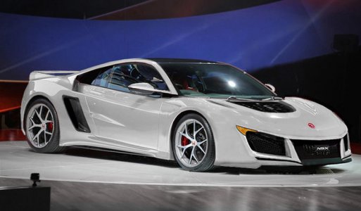
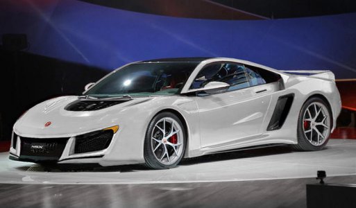
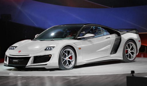
NSX 2.0 Body Kit

.
.
.
Wow, what a chop fest ! :biggrin:

above looks good.

Here's another white although it really does not count cause so many changes lol. Pop ups maybe?

sorry Stephanie.

That is too blocky in the rear
Also Pop-ups will not happen due to "pedestrian safety" :rolleyes:
 
That is too blocky in the rear
QUOTE]

Thats a wing..is that all you noticed??

reverse angle..tried to define wing more for you and took the edge off.

nose has grown even more lol.

the whole gosh darn canopy is dropped lower in the body and....... OK i'm finished with this hunk of junk :biggrin::biggrin:
 

Attachments

  • w1 de.jpg
    w1 de.jpg
    48.7 KB · Views: 886
Last edited:
can you do a side profile?

Ok, hadn't planned on it but I think it would look like...

original...
nsx2_profile_original.jpg


overlay...
nsx2_profile_overlay.jpg


photochopped...
nsx_2_profile.jpg
 
That is too blocky in the rear
QUOTE]

Thats a wing..is that all you noticed??

reverse angle..tried to define wing more for you and took the edge off.

nose has grown even more lol.

the whole gosh darn canopy is dropped lower in the body and....... OK i'm finished with this hunk of junk :biggrin::biggrin:

I wasn't referring to the wing. I was referring to the rear fender.
 
I guess I will weigh in as well. I think all have made good points and most of you all have some serious skills on this photochop stuff. Personally, I like what Vf2ss came up with first over the Saleen Raptor front. To me the the Raptor is a frowning face and I get that enough from my kids. I think it needs to exude strength and at the same time controlled aggression.

Here are two options that attempt to work with the existing design:

NSX Concept Design Tweak 3.jpgNSX Concept Design Tweak 1.jpg

I know its hard to completely tell what I am suggesting, but I really think the side vents work well with the mesh and you could continue that to the small slits below the LED headlights (assuming the black plastic was removed there). The center grill, however, could be left uncovered like our cars which would simplify the front and at the same time make it look high-performance. And like Yinzer suggested, paint the back strip beneath the chrome strip the body color. The chrome strip "beak" isn't going anywhere since the entire lineup is using it and they definitely want to connect this halo car to the other models. (And look at the bright side, at least they have something better than the current Lexus "X" grill.)

I don't have mad Photoshop skills so if anyone could incorporate either of these designs onto the real car, I would appreciate it!
 
Last edited:
.


Rear end extended.

That thing on the door has a purpose : serves as an air intake "spike" for side intakes.

Wow what a session..Well, guess I'll watch the games now :biggrin:
 

Attachments

  • w1n.jpg
    w1n.jpg
    49 KB · Views: 846
Last edited:
Spooler, please add headlights to your ideas :smile: it's difficult to grasp what you're envisioning when I keep wondering how I'm gonna see at night :cool:
 
one_thru_five.png


Who doesn't love the side intakes (#2 above)??? I think they are unique, aggressive and like N Spec said, pay homage to the first gen cars. If you get rid of those, then it just looks like everything else.
 
Spooler, please add headlights to your ideas :smile: it's difficult to grasp what you're envisioning when I keep wondering how I'm gonna see at night :cool:

Gosh what a game!! NFC championship


Hi sorry,

My mind went blank I couldn't come up with anything and left them out hoping someone might put some in there for me lol.

If I were to choose...might seem boring or old school to some but I like a sleek hood. If there is room to stow um (pop ups or retractable) I would.

Your Idea's looks good, are doable and have impressed many, not easy to do in here.

Mine are of a more chemically induced nature.

sucs but here :biggrin:

Thx S
 

Attachments

  • w1z.jpg
    w1z.jpg
    49.1 KB · Views: 790
Last edited:
Who doesn't love the side intakes (#2 above)??? I think they are unique, aggressive and like N Spec said, pay homage to the first gen cars. If you get rid of those, then it just looks like everything else.

Valk, I bummed to say it because it sounds like you really like it. Although appearing unique, the gull-wing-slat above vent#2 has been my least favorite component of the front...and it's been that way from early on because it immediately reminded me of something else. Let me show you something:

NSX Concept | Mazda 3 Sport...
0.jpg


Super impose and remove the hood scoop. Obviously the wheelbases are very different so a controlled-scale up is needed...this way proportions are locked although everything's larger...
2.jpg


Remove everything just above the front air dam (headlights, emblem, remaining panels, etc.)...
3.jpg


Raise it all up to bring the beak up to the hoodline with minor scaling again...
4.jpg


Make cutaways for the headlights...
5.jpg


Overlay (note any similar geometries, slopes, angle, how things line up, Mazda beak, NSX beak, gull-wing slats, air dams, etc.)...
5_overlay.jpg


Color Correction...(and squint a little bit and see if you notice anything) P.S. Please pretend their are no fog lights in vent#2
6.jpg


Suffice it to say, even though the scale overlay is different, our minds see proportions as things will always vary in distance. The Mazda 3 "face" relationship is no lone ranger. This just shows how others' who have kinda thought that have been piecing it together in their brains.

 
Well, looking at all these 'shops, I've come to one inescapable conclusion: I'm really glad you guys aren't designing Honda's cars.
 
Spooler - That helps alot. Headlights be oldskool! That side intake now merged with the buttress intake makes for one HUGE intake...like R8 sides on roids :biggrin:. No problem getting fresh air, right? I've wondered about how to achieve the black canopy with the buttress departure but w/your idea I am beginning to maybe see it.

N Spec - How come I can't see your links? But yes, Furai indeed (I call it furai rice style) :)

Olyar15 - Lol, no problem...and no one's claiming to be, just desk chair critics with design preferences and an opinion. Remember, very first sentence of this entire thread's to "have some fun"
 
Ok then I want to know right now: Are you getting one?

I'm going to try my best, but it will depend on price. Three years ago, when the first concept was shown, the estimated price was $130k and the Canadian dollar was close to par with the U.S. dollar. Now, the estimated price is $150k and the Canadian dollar has dropped quite a bit, meaning that it will likely be $180k+ here, which is much more than I had budgeted.

I'm number 7 on the wait list of a local Acura dealer, with a $1000 deposit. If I can sell my NSX for a good price, or get a decent trade-in, then by this time next year I will hopefully be the owner of a new NSX. Red, just like the version they showed.
 
Last edited:
I'm going to try my best, but it will depend on price. Three years ago, when the first concept was shown, the estimated price was $130k and the Canadian dollar was close to par with the U.S. dollar. Now, the estimated price is $150k and the Canadian dollar has dropped quite a bit, meaning that it will likely be $180k+ here, which is much more than I had budgeted.

I'm number 7 on the wait list of a local Acura dealer, with a $1000 deposit. If I can sell my NSX for a good price, or get a decent trade-in, then by this time next year I will hopefully be the owner of a new NSX. Red, just like the version they showed.

Sell, you'll get much more dough than trade-in value always! Especially for a car like the NSX.
 
^ I concur, but Olyar also has the right to be a desk chair critic w/design preferences and an opinion as well :)

It's awesome Olyar that you're in a position to buy one. Now those exchange rates are harsh! Whether you could buy one or not wouldn't matter as to why you like it though...the first time I saw the NSX on the cover of the Sept 1989 R&T it would be over a dozen years before I got one.
I really do hope this time next year you get a red one...just like the version they showed.

rnt_nsx_89.jpg


It's surreal to think of all the teenagers that are seeing the new one right now and falling in love it...it could be 2040 or so (25yrs from now + 13 to 18yrs) when they are in a position to get one at what...for $85K maybe used? 2040 is just as far away from now as 1990.


Olyar also has the right to be a desk chair critic w/design preferences and an opinion as well :)

Absolutely! But I'm not feeling it. The longer I look at it, the more shoe-like it gets.

It's surreal to think of all the teenagers that are seeing the new one right now and falling in love it...it could be 2040 or so (25yrs from now + 13 to 18yrs) when they are in a position to get one at what...for $85K maybe used? 2040 is just as far away from now as 1990.

Yep. Wonder what the world will be like then.
 
nukem - that earlier side...and after having let it stew, first thing I saw in the nose was a seahorse! Well that can't be good so re-explored some front bumper (cuz that's what the whole idea is about), and decided white...
nsx_2_profile_3.jpg


Note: also shaved that little bump on the roof at the back of the b-pillar and shifted the cabin a hair forward thinking F-22
 
Valk, I bummed to say it because it sounds like you really like it. Although appearing unique, the gull-wing-slat above vent#2 has been my least favorite component of the front...and it's been that way from early on because it immediately reminded me of something else. Let me show you something:

NSX Concept | Mazda 3 Sport...


6.jpg


Suffice it to say, even though the scale overlay is different, our minds see proportions as things will always vary in distance. The Mazda 3 "face" relationship is no lone ranger. This just shows how others' who have kinda thought that have been piecing it together in their brains.

Vf - I appreciate your bro-minded response. And nice job pulling together the research photos. But the the problem with using a Mazda front end here is that it destroys the best part of the design - namely the outer sharp edge that leads the front wheels. In the current NSX design, it provides short front overhang and a flat surface that avoids the front wheel from being framed by ... nothing. Honda is trying to embody an arrow front-end when viewed from above, not a square front-end like typical car designs. When you take this concept to the max like in the S2000, you have a combination of a wedge front-end but when viewed from the rear 3/4 shows nothing in front of the front wheel arch. This can look a bit odd.

That is why in my opinion, the S2000 looks greatfrom certain angles and not so great from others. If you are trying tokeep the front overhang short, I believe its either this design or you are leftwith either an S2000 look or a rounded look like the Corvette:
<!--[if !supportLineBreakNewLine]-->
honda-s2000-roadster-automobile-vehicles-cars-free-autocad-blocks-108.dwg.png


14-corvette-c7-stingray-convertible-05.jpg

<!--[endif]-->
I can't get the Top View NSX photo to paste next to these but if I could, you would see how much better and more interesting it is. Can anybody help me out here?
<!--[if !supportLineBreakNewLine]-->
<!--[endif]-->
 
Back
Top