vBulletin 4.x upgrade
- Thread starter NSX Prime
- Start date
I think the current layout is a cool change, but I am not too picky. If you want some feedback though, I have 3 points:
1. Increase the font size on usernames to make them stand out more. Currently it looks like they are at 12pt, but you probably have the real estate to jack it up to 16px or even 18px if you really feel frisky!
2. I also don't dig on the "Feedback" thingy on the far right as it is too close to the scroll up/down.
3. Put the "support" button in a prominent place to avoid more posts like this
Given your track record of successfully running this website, I have 110% faith in the decisions you have made
Click on Forum Home, then on NSX Picture & Video Gallery.How do I find the Photo Gallery?
I moved it around as a "sticky" thread between General NSX Discussion, Off Topic, and this forum. If it went unread it was not due to lack of exposure.
Thanks for the prompt response! I rarely if ever seek those 3 forums directly and instead go to the "newest threads" lists in Prime or via tapatalk 99% of the time. I mention this only in case there are other blind squirrels like me; important stickies like that may be overlooked if the hope is that everyone will see them in particular forums.
If nothing else at least you're getting glimpses of how members use Prime!
- Joined
- 28 May 2008
- Messages
- 2,500
I moved it around as a "sticky" thread between General NSX Discussion, Off Topic, and this forum. If it went unread it was not due to lack of exposure.
I was really in favor for this upgrade and I'll be honest, I saw the thread, but I didn't completely catch the full scope of the thread. I read it, clicked on it, and created and account. However, I thought you were soliciting feedback on the new "EV" site in anticipation of creating another site for an eletric version. I had no idea we were supposed to evaluate that site as a comparison on how to implement changes for this site.
This is really my fault for not reading the thread completely and understanding the intent, but at a quick glance, that was my understanding and why I wasn't involved in providing my .02. However, if it was THAT important, I'm surprised it wasn't an announcement rather than a stuck thread. You used announcements for Enthusify and it worked great, so I would've thought you would do the same for soliciting feedback/recommendations.
- Joined
- 21 December 2005
- Messages
- 1,215
I moved it around as a "sticky" thread between General NSX Discussion, Off Topic, and this forum. If it went unread it was not due to lack of exposure.
Yes but it's not near the top of my list at the moment.
It sounds like your concerns here could mostly be addressed by tweaking the style colors..?
OK thanks for the info. I hope others who use subscribed threads will give this a try.
As best I can tell it's a global either-or option:
[TABLE="class: tborder, width: 90%, align: center"]
<tbody>[TR]
[TD="class: optiontitle, bgcolor: #00A6DA, colspan: 2"]Use Legacy (Vertical) Postbit Template[/TD]
[/TR]
[TR]
[TD="class: alt1, bgcolor: #0098CC"]If you prefer the old-style postbit, using two vertical columns rather than the new horizontal layout, you can switch back to using that template with this switch.
Please note that if you enable this option and wish to customize the template, you should edit the 'postbit_legacy' template rather than the 'postbit'.[/TD]
[TD="class: alt1, bgcolor: #0098CC"][TABLE="class: outer_border, width: 100%, align: left"]
<tbody>[TR]
[TD]<label for="rb_1_setting[legacypostbit]_125"><input type="radio" name="setting[legacypostbit]" id="rb_1_setting[legacypostbit]_125" value="1" tabindex="1">Yes
</label><label for="rb_0_setting[legacypostbit]_125"><input type="radio" name="setting[legacypostbit]" id="rb_0_setting[legacypostbit]_125" value="0" tabindex="1" checked="checked">No</label>[/TD]
[/TR]
</tbody>[/TABLE]
[/TD]
[/TR]
</tbody>[/TABLE]
There may be some way to use a plugin or hack to make it user-selectable but I'm not going down that road right now. If you know of some other setting I have missed, please let me know.
You have always been able to do that w/ the Google Site Search.. Before the upgrade it was in the forum header. I'm working to bring it back, but until then you can use the tip a couple other people have already posted in this thread.
I tried searching in Google, but came up with nothing. Maybe I'm not using the correct wording. Try asking on vbulletin.org or vbulletin.com, someone on either site is guaranteed to know how to do it.
Would love to have the old style back (using two vertical columns).
Does it show up that way in your post after the topic is updated, or only when you're typing the post in?seems there is an issue when editing..the last word of the first sentance is repeated even though you type it once.
I've noticed a repetition of words showing up when I'm typing into the reply box, but it's only a display issue; once I actually go ahead and post the reply, any automatically-generated repetition does not appear in the actual post when displaying the entire topic.
Ie8.
Note - I typed the above with an uppercase "E" but the software changed it to lowercase.
Note - I typed the above with an uppercase "E" but the software changed it to lowercase.
Last edited:
If you type a word in caps by itself, the software will correct it because it thinks you're "yelling". However if you type it in a sentence, such as IE8 is a crappy browser  , it leaves it alone.
Try using Chrome, it is way faster than IE and I have had no issues with this version of vbulletin so far.
Test
Try using Chrome, it is way faster than IE and I have had no issues with this version of vbulletin so far.
Test
Last edited:
windows 7 ...................it happens with edit box only,also the smiley box will be empty depending on where in the screen you hover over the icon. so I just edited this and it did not duplicate a word....I have seen other people posting with duplicated words.so maybe I'm dreaming..
Last edited:
doc, I believe you're referring to the editing behavior where it adds new content to your post under an "- - - Updated - - -" separater (like below).
- - - Updated - - -
I just noticed the new "Chats" counter under our Post counts. *Sigh*, another thing to worry about, lol.
- - - Updated - - -
Test #2 - this is a new post, seeing if it just adds it to my previous post as an update. Update: yup, it sure does. Will have to figure out a new way to post whore.
- - - Updated - - -
I just noticed the new "Chats" counter under our Post counts. *Sigh*, another thing to worry about, lol.
- - - Updated - - -
Test #2 - this is a new post, seeing if it just adds it to my previous post as an update. Update: yup, it sure does. Will have to figure out a new way to post whore.
Last edited:
Try using Chrome, it is way faster than IE and I have had no issues with this version of vbulletin so far.
Are you suggesting a browser or asserting that you're better with numbers than Ken and docjohn?
http://www.calcudoku.org/papers/
(I also much prefer Chrome...very nice browser...and vBulletin 4 is working great.)
Last edited:
Perhaps both, lol. Thanks for the link, I'll use it to tease my IE/Firefox using friends.Are you suggesting a browser or asserting that you're better with numbers than Ken and docjohn?
http://www.calcudoku.org/papers/
(I also much prefer Chrome...very nice browser...and vBulletin 4 is working great.)
I too find the 2 column layout easier to read up and down the page without your eyes having to skip over all the icons and user names. Its also easier for the eyes to scan a narrower column of text when reading and as I get older and have more floaters, the less I want my eyeballs darting left and right. Many of you will know what I'm talking about!
One of the other boards I frequent recently upgraded to this horizontal layout and I noted at the time I preferred the old 2 column layout too (right side of the image above). So, put me down for another strong 2 column vote. :smile:
Lud, thanks for all you do with the site!
Last edited:
FWIW, in case anyone else was wondering you can turn off the chat window in your CP settings.
- Joined
- 28 May 2008
- Messages
- 2,500
FWIW, in case anyone else was wondering you can turn off the chat window in your CP settings.
Rather than turning it off, I found it easier to just click the small arrow on the top right of the box to minimize it. It atleast gives me the opportunity to open the window again to look if I want, but for the most part - takes it off the screen.
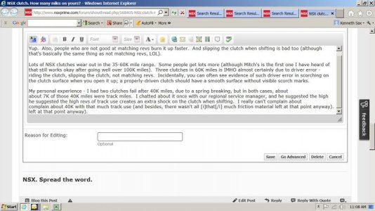
I just noticed this when I was editing a post, and I captured it in the screen shot below. Look closely at the last paragraph of the post; the first two paragraphs don't have any repetition.I've noticed a repetition of words showing up when I'm typing into the reply box, but it's only a display issue; once I actually go ahead and post the reply, any automatically-generated repetition does not appear in the actual post when displaying the entire topic.
Now that I think of it, I don't know whether this happens when posting a reply initially, or only when going back and editing it. But at least here is an example where you can see the repetition for yourself.
Attachments
Last edited:
- Joined
- 28 May 2008
- Messages
- 2,500
I just noticed this when I was editing a post, and I captured it in the screen shot below. Look closely at the last paragraph of the post; the first two paragraphs don't have any repetition.
Now that I think of it, I don't know whether this happens when posting a reply initially, or only when going back and editing it. But at least here is an example where you can see the repetition for yourself.
What windows and IE version are you on? It looks really dated and if my guess is right, no longer supported.
Similar threads
- Replies
- 0
- Views
- 121
- Replies
- 0
- Views
- 293
- Replies
- 0
- Views
- 310
- Replies
- 0
- Views
- 347


