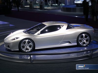
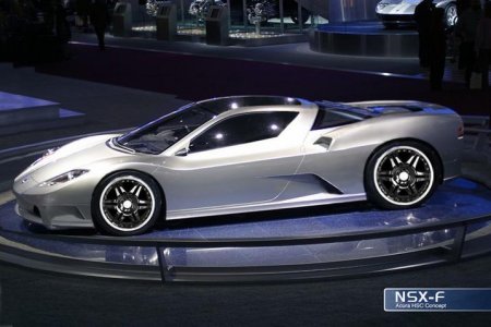
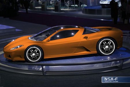
So I was doing a google search for NSX concept photoshops and came across this which was posted a few years back on another forum. I think it is gorgeous, and addresses the shortcomings of the HSC concept- which I still believe would have been THE appropriate evolution of the NSX. I personally don't recognize the new NSX concept as an authentic NSX and think they should name it similar to the CR-Z if they insist on making the mistake of producing it (NS-Z). This HSC photoshop shows a lengthened tail and is much more resolved from the doors back. If only Honda would get their heads out of their asses.
You are using an out of date browser. It may not display this or other websites correctly.
You should upgrade or use an alternative browser.
You should upgrade or use an alternative browser.
What could have been- HSC Photoshops
- Thread starter Nero Tenebre
- Start date
I think a wrap-around rear window is part of the NSX's DNA. These HSC renderings have it, which gives them an evolutionary feel. The new NSX is missing too many design elements of the original IMHO.
I think a wrap-around rear window is part of the NSX's DNA. These HSC renderings have it, which gives them an evolutionary feel. The new NSX is missing too many design elements of the original IMHO.
So is the long overhang on the rear and low, sculpted bodywork. God I wish they would make this car and honor the NSX.
Personally I never liked the rear window treatment...doesn't flow at all. Taper it back like the orig nsx. The tail lights on the HSC is a fail as well. 
I don't mind the c pillar but the taillights were a fail. Hardly a reason to scrap the whole thing though, just figure out the rear treatment and you've got a homerun.
For me the HSC was DOA. It's like the front and rear are from two different cars. Really glad they decided to redesign.
What could have been the HSV and I also played with the Ferrari Italia body on the NSX.

Video
www.youtube.com/watch?v=ZTy4XKGtMJQ

Video
www.youtube.com/watch?v=ZTy4XKGtMJQ
The hsv was front engine and looked nothing like an NSX.
For me the design elements of the HSV are the most timeless classic designing that Honda has ever made.

I rather choose the best design then try to make something lesser by making it like the old design language.
Here are a list of cars I complied, maybe someone can design a gem for us.


I rather choose the best design then try to make something lesser by making it like the old design language.
Here are a list of cars I complied, maybe someone can design a gem for us.


Both myself and Steve love this car for its pure cab forward midengine supercar design.http://www.google.com/images?hl=en&...12l623l0.2.0.1l3l0&oi=image_result_group&sa=X
Wow these proportions sure are pure and its just a really nice design too.

Looking around I found this design said to be inspired by the Jag... which is sharper and boxy.
Jansen Carbon X12 for a video game?

My first car designs were to actually emulate this sports car as the purple car in the picture.

I really like the original Jag and thinks its worthy as an NSX design but I still think the HSV design has more life, soul or character to it.

Looking around I found this design said to be inspired by the Jag... which is sharper and boxy.
Jansen Carbon X12 for a video game?

My first car designs were to actually emulate this sports car as the purple car in the picture.

I really like the original Jag and thinks its worthy as an NSX design but I still think the HSV design has more life, soul or character to it.
Last edited:
I like the new NSX OK, but I had hoped for something NSX-like but with MORE NSX-ness. Like this! :biggrin:

I LOVE THIS ONE! the head lights take the form of the pop-ups when down (LOVE), and they're fixed so no pop-up at night (LOVE)! best of both generations, imho.
It would have been cool if Honda elvolved the NSX in the same way that Porsche evolves the 911, rather than going for a revolution every now and then.
Both myself and Steve love this car for its pure cab forward midengine supercar design.http://www.google.com/images?hl=en&...12l623l0.2.0.1l3l0&oi=image_result_group&sa=X
Yup. The Jag looks more curvy and proportional with its wider stance. The NSX is a little too narrow and angular. I also love the Jiotto Caspita.
Steve
Yup. The Jag looks more curvy and proportional with its wider stance. The NSX is a little too narrow and angular. I also love the Jiotto Caspita.
Steve
jiotto caspita= pure distilled sex!:biggrin:
It would have been cool if Honda elvolved the NSX in the same way that Porsche evolves the 911, rather than going for a revolution every now and then.
Yeah then it would have heritage instead of all wheel drive bullshit.
I played with the BMW Nazca styling and the a Jag Body


I know lots of primers love the HCS but I always felt the car's b pillar and related panels are boring and lack of style. Not aggressive enough.
Similar threads
- Sticky
- Replies
- 22
- Views
- 8K
- Sticky
- Replies
- 43
- Views
- 23K
- Replies
- 19
- Views
- 5K
- Replies
- 0
- Views
- 1K


