You are using an out of date browser. It may not display this or other websites correctly.
You should upgrade or use an alternative browser.
You should upgrade or use an alternative browser.
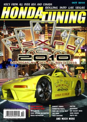
NSXPO magazine cover
- Thread starter ONEADAM12
- Start date

whats up.... 137 views and nobody has an opinion???? now i know there are plenty of opinionated fellas on this board....let me know... thanks..dave
ok, the format looks fine but the distorted look of the car is somewhat troubling. The angle makes the car look chunky. Give the car a low, squat and more natural look, maybe shot from a higher angle and you will have a winner.
My $.02
Tytus
My $.02
Tytus
I think that looks great for the exception of the NSX that was chosen. Honestly I would not use that car since it looks like fast and furious/ricer. I would use a cleaner looking example of a car like SerialNSXers type-r clone/ or CDX-NSX Grams car or if you want a GT like NSX then use VegasNSX's widebody fxmd or Coz's FXMD widebody, even FXMD's race NSX over that one......or something like Alex V's Gruppe M NSX or racerjiling's nsx(
Honda Tuning should have used a clean example to represent the owners and not something that came out of fast and furious.
If that is your car then or someone that you know then I do apologize if I hurt someone's feelings....but you wanted an opinion, so I am giving it.
So heres my nominee's of what kind of examples you should look at
Widebody categories nominations: In no preference of order
1.Vega$NSX(FXMD) Turbo
2.Coz(FXMD) Turbo
3.FXMD Race Car Turbo Unlimited Time Attack Car
4.Racerxjling supercharged 2.4 2002+ face
5.SFDreamer- turbocharged 2002+ face
6.Umbrella's Sorcery Orange NSX( I don't normally like bodykits like these, but this one looked good when it came out)
7.STMPO's widebody Turbo NSX assuming its all finished
Oem non-wide Body nominations- No preference of order
1.Alex V. Gruppe M supercharged NSX (GT track looking car)
2.SerialNSXer's the only true US type-r clone with 3.8L stroker
3. Peter Yi's 3.8L Stroker motor 2002+ Downforce NSX
4. CDX-NSX Gram's fully built procharger NSX from MV Designs
5. Jon Martin's 3.8L clean oem bodied NSX
6. Lowellhigh79 Danny Youngs 1000HP twinturbo NSX
These cars you see here have everything you can imagine on an NSX as far as suspension, motor, brakes, interior, exterior......these guys here from what I have seen have some of the cleanest or extreme cars(FXMD Race Car)
or Umbrellas show car.
I have seen all of these cars with the exception of three which is the FXMD, umbrella one, and STMPO's, but in pictures they look pretty cool.
All the other cars I have seen in person and rode in them and they are F-N awesome.
PS- I just realized you just added the logo in there.....I wish these magazines stop choosing wacked ass examples in representing a community. It seems like they like to choose the riciest looking cars or something that they think would look cool.
Last edited:
thanks for the feed back.... it is a work in progress.... i used a 1/18 scale car for the picture.... not ment to be a final product.. i too noticed the distorted look of the car.... it was the angle i shot the car with my camera... i intend on redoing the picture.... i have been talking with the NSXPO organizers and NSXCA about maybe doing something like this as an item for NSXPO 2010 attendees.... my thought would be to customize the cover with each attendees car and maybe name on the cover some how....
just some ideas....
oh BTW... the entire cover was made from scratch...it is NOT a Honda Tuning actual cover..... the car in the picture is a 1/18 scale Muscle Machines car i stripped and added the NSXPO logo to .... something else i am talking to the NSXPO and NSXCA guys about...
just some ideas....
oh BTW... the entire cover was made from scratch...it is NOT a Honda Tuning actual cover..... the car in the picture is a 1/18 scale Muscle Machines car i stripped and added the NSXPO logo to .... something else i am talking to the NSXPO and NSXCA guys about...
Last edited:
Does that NSX have 26"s??
shawn110975
Suspended
yeah use a different angle like from above and down. those kind of angles make the NSX look so bad ass.
thanks for the feed back.... it is a work in progress.... i used a 1/18 scale car for the picture.... not ment to be a final product.. i too noticed the distorted look of the car.... it was the angle i shot the car with my camera... i intend on redoing the picture.... i have been talking with the NSXPO organizers and NSXCA about maybe doing something like this as an item for NSXPO 2010 attendees.... my thought would be to customize the cover with each attendees car and maybe name on the cover some how....
just some ideas....
oh BTW... the entire cover was made from scratch...it is NOT a Honda Tuning actual cover..... the car in the picture is a 1/18 scale Muscle Machines car i stripped and added the NSXPO logo to .... something else i am talking to the NSXPO and NSXCA guys about...
Ok cool np I am glad that was not done by Honda Tuning...would have to kill aaron for that one....j/k aaron :smile:
If you are going to use a scale model or something look at kyosho or taimaya model cars.....kudos to you on photoshopping skills....keep at it.
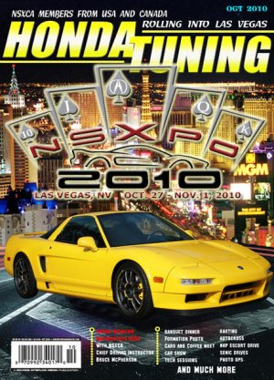
Thats much more like it and represents how the majority or the owners look like.
One little detail I would do is to photoshop the grill in the bumper black since its not painted from the factory like that....I am talking about the fins in the bumper....the middle piece is fine because that is from factory painted.
One little detail I would do is to photoshop the grill in the bumper black since its not painted from the factory like that....I am talking about the fins in the bumper....the middle piece is fine because that is from factory painted.
I think your idea and concept works well. With just a few more adjustments I think you're on your way to a good design. Below are some critiques that can hopefully help you towards a positive direction.
Subject: Car
Subject: Top-most text
Subject: NSXPO 2010
I hope my critique helps. If you have any questions, feel free to ask or pm me. I'd be more than happy help.
Keep up the good work!
Subject: Car
- The rear tire width of the vehicle appears to be very thin
- Because there are no shadows towards the rear, the car appears to be "floating"
- The angle or perspective of the vehicle is slightly offset relative to the ground
- I would also suggest coloring the vertical grill on the front bumper (as noted by ediddynsx)
Subject: Top-most text
- The white text on the very top may need a little more attention to kerning, tracking, and specially word spacing. The spacing between each word affects the natural flow of words readers are used to.
- The font that you used is ok. But I would encourage to experiment a little with simpler fonts such like helvetica, arial, and gill sans and play around with their attributes (ie. point size, bold, italics etc).
- I like how you are experimenting with color within your layout, however because your composition already has a spectrum of colors I would discourage introducing a new color to the mix (referring to the color of the date). It starts to take away from your focal point and affects the hierarchy of the composition.
- There are also some artifacts below the "OCT 2010," that I would clean up. The artifacts may be due to exporting as a low-res image. But if its in the image I would do a quick pass with clone-stamp or healing brush tool and your good.
Subject: NSXPO 2010
- I would highly discourage the use of bevel/emboss and outer glow (unless used effectively with subtlety). It's a common effect used by new designers and calls out "amateur." But its ok, I also used it in my earlier designs thinking it was such a cool effect.
- Due to the background image being so busy, the nsxpo logo becomes difficult to read.
I hope my critique helps. If you have any questions, feel free to ask or pm me. I'd be more than happy help.
Keep up the good work!
I think your idea and concept works well. With just a few more adjustments I think you're on your way to a good design. Below are some critiques that can hopefully help you towards a positive direction.
Subject: Car
- The rear tire width of the vehicle appears to be very thin
- Because there are no shadows towards the rear, the car appears to be "floating"
- The angle or perspective of the vehicle is slightly offset relative to the ground
- I would also suggest coloring the vertical grill on the front bumper (as noted by ediddynsx)
Subject: Top-most text
- The white text on the very top may need a little more attention to kerning, tracking, and specially word spacing. The spacing between each word affects the natural flow of words readers are used to.
- The font that you used is ok. But I would encourage to experiment a little with simpler fonts such like helvetica, arial, and gill sans and play around with their attributes (ie. point size, bold, italics etc).
- I like how you are experimenting with color within your layout, however because your composition already has a spectrum of colors I would discourage introducing a new color to the mix (referring to the color of the date). It starts to take away from your focal point and affects the hierarchy of the composition.
- There are also some artifacts below the "OCT 2010," that I would clean up. The artifacts may be due to exporting as a low-res image. But if its in the image I would do a quick pass with clone-stamp or healing brush tool and your good.
Subject: NSXPO 2010
- I would highly discourage the use of bevel/emboss and outer glow (unless used effectively with subtlety). It's a common effect used by new designers and calls out "amateur." But its ok, I also used it in my earlier designs thinking it was such a cool effect.
- Due to the background image being so busy, the nsxpo logo becomes difficult to read.
I hope my critique helps. If you have any questions, feel free to ask or pm me. I'd be more than happy help.
Keep up the good work!
There you have it.
Not too shabby. But I just don't like the background. Too "busy" IMO. Just need to pick a landmark location like Caesar's Palace and go with it. But hey it's all subjective. :smile:
Been learning how to do Photoshop.... playing around with some pictures.... came up with this one....what do you think....Dave
Cool my car is on the cover! J/k:biggrin:
So heres my nominee's of what kind of examples you should look at
Widebody categories nominations: In no preference of order
1.Vega$NSX(FXMD) Turbo
2.Coz(FXMD) Turbo
3.FXMD Race Car Turbo Unlimited Time Attack Car
4.Racerxjling supercharged 2.4 2002+ face
5.SFDreamer- turbocharged 2002+ face
6.Umbrella's Sorcery Orange NSX( I don't normally like bodykits like these, but this one looked good when it came out)
7.STMPO's widebody Turbo NSX assuming its all finished
WhooHoo Numbah 1! Numbah 1! Numbah 1!

(Conveniently ignoring the no preference to order.) :tongue::biggrin::tongue::biggrin:
In the widebody category, I think mine is worth a look....Look in buildup section or cars and coffee dallas texas section
If it was available as a poster I'd hang it up in the garage over the car.:biggrin:
If i get aproval from the NSXPO committee, i can print them in ANY size you want.... up to 44" wide....
i have proposed the idea to them and waiting their response... i can insert your personal car into the cover.... even you too if you would like.....
Last edited:
- Joined
- 5 March 2010
- Messages
- 3
Put a layer mask over the cityscape, gradient.....maybe try turning the opacity to 60-75%. The logo really gets lost in the background....or put the car in front of the cityscape and logo over the black top:wink:
Similar threads
- Replies
- 4
- Views
- 303