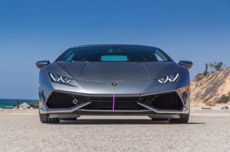
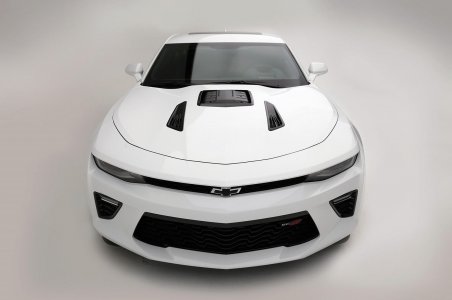
The new NSX is controversial because it doesn't have a very long stretching front bumper like the rest of the exotics; 458, 488, Huracan, Carrera GT, etc. The NSX hood is extra long and low stretching for perhaps engineering reasons for extra space for cooling maybe... But regardless of the optical illusion, it's right there with the rest of them in terms of geometry. It's not like the R8 with the definitive high hood and fender line. I'm still waiting for a pic of the R8, first gen or 2nd gen next to the 2nd gen NSX. You'll see they are nothing alike in geometry.
You are using an out of date browser. It may not display this or other websites correctly.
You should upgrade or use an alternative browser.
You should upgrade or use an alternative browser.
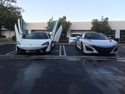
NSX from Lambo Newport meet
- Thread starter nsxsupra
- Start date
JHC.
I think you're all below the yellow line. :tongue:

Hahahaha :biggrin:
Who cares about the hoodline? The entire argument, on both sides, is completely useless. Jeeeeeez....
...and LOLz at gleibig.
...and LOLz at gleibig.
Effer, you can't deny geometry. How did you pass middle school math?

The hood line sits higher than the NSX. Look at pics.
View attachment 144836
You can see the red line starts where the Porsche's hood line end and sits much higher than the NSX's hoodline.
We cannot draw any conclusion from those lines. Moreover, your methodology is not rigorous ... Again, your are willing to manipulate and build anything absurd to prove your point of view ...
Ok, I see where our terminology got messed up. This whole on-the-side discussion in this thread about Lambos' supposed to be about now the middle white line in your pic (or the redline in the previous). The bow of the car if you will...and how it's interpreted by the viewer. Low or high. Exotic or sedan-like. Aggressive or diffident. And I agree with Effer that on the NSX it registers as the front of the car *appearing* not steep enough regardless of the tape measures.
Interestingly, the Greeks corrected visual distortion all the time...they <bowed out all their columns> on their temples (convex) to make them appear straight. If they were mathematically straight they would actually appear concave and have diminished the straight perception the architect wanted the viewer to experience/receive; They curved the floors instead of keeping them mathematically level so it would appear straight and look level; They tilted the architrave/frieze/cornice toward the viewer so that it would appear straight because if it was technically straight it actually looked distorted, etc. They spent centuries perfecting how an object would be perceived visually and took it very seriously, and ensured that everyone would see it the way they intended it to be seen...as straight (even though it never was). The front of the NSX has the right proportions (again, has never been really an issue here), it's just the execution of the front end details harbor so many design drawbacks in addition to not appearing steep enough for many ...the last of the now antiquated beak, sedan-style-hanging headlights, faux mesh grill, lack of recognizable homage to the original, etc. As pointed out...there's reality and there's perception. Perception is reality...reality is perception.
Very interesting reading.
Who cares about the hoodline? The entire argument, on both sides, is completely useless. Jeeeeeez....
...and LOLz at gleibig.
Ignorance is bliss ...
we may need some volunteers to rank which supercars produce aka's or bka's to pedestrians....
ROFLMAO! Now here's a useful measure, and probably readily quantifiable, too. Can we convince the IIHS to add the number of stars for this?
Whatever nomenclature you want to apply to the "pink" line (in the photo).... That line is too lengthy on the new NSX. (IMO)
That's the front view's optical illusion. Basically, you and many people are telling Honda to make extremely long front bumpers for the new NSX to "fit in with the crowd."

The long nose for the Huracan is disproportionate. For me, what makes the Huracan attractive is the V10 and low roofline. Not the front end's extended nose and no ass. If Lambo put a turbo V6 or 4 cylinder in the Huracan, most people would find it unappealing too...
Example:
You can clearly see that the hood of this vehicle extends down to the yellow line.
View attachment 144871
You can clearly see that the hood of this vehicle extends down to the yellow line.
View attachment 144871
The new NSX is controversial because it doesn't have a very long stretching front bumper like the rest of the exotics; 458, 488, Huracan, Carrera GT, etc. The NSX hood is extra long and low stretching for perhaps engineering reasons for extra space for cooling maybe... But regardless of the optical illusion, it's right there with the rest of them in terms of geometry.
vs.
That's the front view's optical illusion. Basically, you and many people are telling Honda to make extremely long front bumpers for the new NSX to "fit in with the crowd."
Can you clarify...these quotes seem inconsistent. Which is it...does the NSX fit in with the crowd because the geometries are the same? But then it doesn't because of an optical illusion?
At any rate, that was the whole point of referencing Vitrivian architecture. A good designer does not and should not stop just when the geometry is accurate...they have to take it to the next level to ensure that it registers properly when being looked at. In the real world often times geometry has to take a back seat..that's what the Greeks/Romans did...they did not insist and make every floor, cornice, column technically straight and say if you don't think it looks that way, tough noogies (and it really wouldn't have looked straight). They made sure it would appear straight by understanding visual distortion and correction after correcting the geometry. There are so many instances in life with other large investments we make like housing construction/remodels where you have to make adjustments here and there to make it appear the way you want it: a ceiling dips here, a wall leans a little there, a section has to much mud on it, etc. you have to do what it takes to make it appear straight or how you want it and geometry at that point takes a back seat.
Quickie's pink line is what this is ALL about when it comes to why some are displeased and not buying, and it's the simplest way to represent the problem. A murdered-out NSX does not solve this issue since it still has a faux mesh grill right there providing a much taller pink line. And in the end, no one cares what the ACTUAL geometry is even if it is right, not consumers, not the Greeks and Romans, etc, it has to appear right. The young(er) 2.0 design team perhaps were just not yet capable of bringing the fascia to the point of being refined to the level that a $200,000 car should have.
<style type="text/css">p.p1 {margin: 0.0px 0.0px 0.0px 0.0px; line-height: 16.0px; font: 13.0px Verdana; color: #232323 }span.s1 {font-kerning: none}</style>And again, I'm not knocking the car as a whole, I know it is amazing to drive and owners LOVE them! And Honda/Acura’s marketing success in their mind might be very straightforward…simply that they were able to do it and make it happen. They got their name back up in the performance charts, graced the cover of many magazines after all these years, invented new tech that will trickle down to other models and for this, they do deserve a big round of applause. It took courage to go for it.
However, coming from a three decade diehard Acura fan, their success in my mind wasn’t based upon how many of these they sell/sold, or what magazine says, …it's simply based upon whether or not it gave me the feeling again to want to buy (any of) their cars again…namely this car...once more...and sadly, it did not. There is an order as to how things are introduced to our hearts and minds and it all starts with whether or not what you see gives you this feeling or not in just a mere fraction of a second. Cheap interior parts and/or antiquated beaks can do that to a buyer and should not be underestimated. Why? Because at the end of the day you HAVE to have a gut-level connection with the car before you connect at the steering wheel. You see it with your eyes before you will feel it with your hands. You marvel at its looks before you marvel at the throttle. This is the "X" factor-full of passion and enthusiasm for a sports car we ALL long to feel and it cannot be measured by geometry. I would venture to say that whoever pre-ordered might have felt this way and they are true "winners" in all of this...they are the lucky ones.
How did this thread become? A guy who owns an nsx just posted some pictures and shared an event. Sheesh. I am learning some though! Lol
^Indeed! Lol
^Indeed! Lol
Attachments
Interesting debate. I see the argument and perspective from both sides.
Shocking, compare to my 570S or 6spd LP550-2 the front area is about the same despite look like it is not. The edge of front bumper line starts at approximately 1.25 inches in front of beak. Now take a 2004 NSX draw a line in upper part of front bumper (approximately 2 inches in front of emblem) and draw a line from there vertically to bottom of front opening, don't be shocked.
The hood line is in NSX is in line with Huracan and 570S. Huracan has long front bumper and one of smallest front area. The NSX front bumper portion is short where from hood to edge of beak compare to other cars (the true edge is 1.25~1.5 inches in front of beak) , where they are about 3 to 5 inches longer. Naturally combined with black front section this will create an optical effect that the front area might look to be too big. Never heard of any one complain about R8 front. Take a look and come back.
The beak has quickly becoming my favorite design element from least liked design element. Cutting edge design takes time getting used to. I have not yet came across a single person not amazed by the design. I tried so many ways to make it better, from changing color of beak, add touches to the side skirts with countless combinations, yet somehow the way it was is the best. I removed the carbon wrap from the beak, as by wrapping it, it just makes the front looks even bigger, and the silver beak looks good on all colors. By making it black just makes front bumper looks even shorter and front area even bigger.
End of the day if one is not going to like a car, they will find a million excuses to not like it. That is absolutely fine, but I know they are dead wrong and it will be one of their biggest automotive mistake. My business partner was one of the biggest naysayer about the gen 2 NSX with a million reasons to steer me away from getting one. From how it is no longer a NSX, price too high for Honda, you name it, he threw it at me. Then he bought one before me and helplessly became his favorite car of all time.
Attachments
Last edited:
vs.
Can you clarify...these quotes seem inconsistent. Which is it...does the NSX fit in with the crowd because the geometries are the same? But then it doesn't because of an optical illusion?
At any rate, that was the whole point of referencing Vitrivian architecture. A good designer does not and should not stop just when the geometry is accurate...they have to take it to the next level to ensure that it registers properly when being looked at. In the real world often times geometry has to take a back seat..that's what the Greeks/Romans did...they did not insist and make every floor, cornice, column technically straight and say if you don't think it looks that way, tough noogies (and it really wouldn't have looked straight). They made sure it would appear straight by understanding visual distortion and correction after correcting the geometry. There are so many instances in life with other large investments we make like housing construction/remodels where you have to make adjustments here and there to make it appear the way you want it: a ceiling dips here, a wall leans a little there, a section has to much mud on it, etc. you have to do what it takes to make it appear straight or how you want it and geometry at that point takes a back seat.
Quickie's pink line is what this is ALL about when it comes to why some are displeased and not buying, and it's the simplest way to represent the problem. A murdered-out NSX does not solve this issue since it still has a faux mesh grill right there providing a much taller pink line. And in the end, no one cares what the ACTUAL geometry is even if it is right, not consumers, not the Greeks and Romans, etc, it has to appear right. The young(er) 2.0 design team perhaps were just not yet capable of bringing the fascia to the point of being refined to the level that a $200,000 car should have.
<style type="text/css">p.p1 {margin: 0.0px 0.0px 0.0px 0.0px; line-height: 16.0px; font: 13.0px Verdana; color: #232323 }span.s1 {font-kerning: none}</style>And again, I'm not knocking the car as a whole, I know it is amazing to drive and owners LOVE them! And Honda/Acura’s marketing success in their mind might be very straightforward…simply that they were able to do it and make it happen. They got their name back up in the performance charts, graced the cover of many magazines after all these years, invented new tech that will trickle down to other models and for this, they do deserve a big round of applause. It took courage to go for it.
However, coming from a three decade diehard Acura fan, their success in my mind wasn’t based upon how many of these they sell/sold, or what magazine says, …it's simply based upon whether or not it gave me the feeling again to want to buy (any of) their cars again…namely this car...once more...and sadly, it did not. There is an order as to how things are introduced to our hearts and minds and it all starts with whether or not what you see gives you this feeling or not in just a mere fraction of a second. Cheap interior parts and/or antiquated beaks can do that to a buyer and should not be underestimated. Why? Because at the end of the day you HAVE to have a gut-level connection with the car before you connect at the steering wheel. You see it with your eyes before you will feel it with your hands. You marvel at its looks before you marvel at the throttle. This is the "X" factor-full of passion and enthusiasm for a sports car we ALL long to feel and it cannot be measured by geometry. I would venture to say that whoever pre-ordered might have felt this way and they are true "winners" in all of this...they are the lucky ones.
Fit in the crowd with current trends. The geometry is there, but people are confused by the controversial front bumper. The NSX is virtually the same size as the current McLaren and Ferrari. As pictured. The difference in detail is that the Italians have long front bumpers that give the illusion of a super small/low hoodline. I think it's a compromise that makes the front end look too heavy and long. The antithesis of a mid engine car.
People try to make silly comparisons of the new NSX to the Camaro or R8, but those cars have a much larger geometry.
Again, as said by NSXSupra and other owners. Haters are going to hate for whatever reason. I don't have to type long extended paragraphs to try and explain why I don't like a design. I move on and go somewhere that has something I like instead of crying endlessly like Effer with pipe dreams of a 200 hp/Liter Honda in a Italian influenced shell for ~$100K.
TGIF ~ we find the arguments here quite funny - like you can ever measure a car by drawing lines out of thin air LOL
This is all personal bias, anyways here's our contribution:
*for poster who requested the R8 and new NSX we might be able to accommodate that request as expecting a 2017 R8 to be dropped off for some carbon / stereo work next week

This is all personal bias, anyways here's our contribution:
*for poster who requested the R8 and new NSX we might be able to accommodate that request as expecting a 2017 R8 to be dropped off for some carbon / stereo work next week

Similar threads
- Replies
- 1
- Views
- 367
- Replies
- 1
- Views
- 210


