You are using an out of date browser. It may not display this or other websites correctly.
You should upgrade or use an alternative browser.
You should upgrade or use an alternative browser.
New NSX Info
- Thread starter brucewinter
- Start date
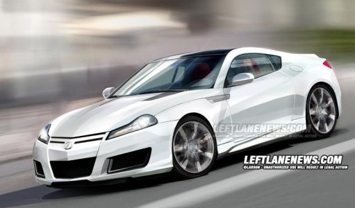
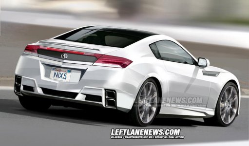
If their estimate is accurate, that translates to almost exactly $ 150,000.
At that price this normally aspirated V10 supercar, making 550+ HP and featuring sophisticated SH-AWD and use of exotic material, from HONDA would be very tempting.
At that price this normally aspirated V10 supercar, making 550+ HP and featuring sophisticated SH-AWD and use of exotic material, from HONDA would be very tempting.
Also on leftlanenews.


Given all the (ugly) recent grills on Hondas, I think the chance of that happening is about zero in a bazillion.
sporteknik
Guest
- Joined
- 15 October 2008
- Messages
- 73
hmm...I swear I've seen this picture before...It's probably just my imagination.


hmm...I swear I've seen this picture before...It's probably just my imagination.

Good eye! That interior is damn near identical.
Good eye! That interior is damn near identical.
It seems to be just a generic guess-timate.
- Joined
- 31 January 2008
- Messages
- 276
hmm...I swear I've seen this picture before...It's probably just my imagination.

You're da man. The first one on the internet to spot this. Other than possibly the Mercedes board... who probably doesn't even know that the NSX pic exists anyway.
They probably don't care what the Japs are doing anyway.
sporteknik
Guest
- Joined
- 15 October 2008
- Messages
- 73
Thanks, I'm surprised no one else on the interwebs realized this.
The "experts" on Autoblog, FinalGear and Vtec.net all claim the image to be legitimate.
The angles and proportions of the cutaway are completely off. It has to be the most amateurish cutaway/illustration I've seen in a long time.
Apparently it's creator can't be bothered to change a single pixel of the windshield wipers.
It's laughable that a somewhat half-assed photoshop can dupe so many people, even writers of "respected" automotive websites.
http://www.autospies.com/news/Cutaway-Shows-The-True-Nuts-And-Bolts-Of-Acura-s-New-NSX-37658/
http://www.0-60mag.com/online/?p=5744
http://www.leftlanenews.com/acura-nsx.html
Last edited:
sporteknik
Guest
- Joined
- 15 October 2008
- Messages
- 73
Here's a link to the full resolution SLR cutaway.
http://www.seriouswheels.com/pics-mno/Mercedes-Benz-SLR-McLaren-Cutaway-1920x1440.jpg
http://www.seriouswheels.com/pics-mno/Mercedes-Benz-SLR-McLaren-Cutaway-1920x1440.jpg
- Joined
- 1 September 2001
- Messages
- 4,123
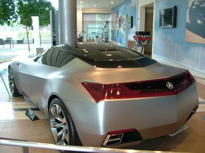
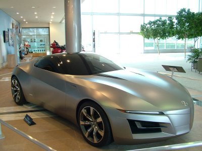
Is it just me, or does that show car look better than I remember? You can easily see it's connection with the test car. Now we just have to wait to see the real deal.
Damn Major are you in Japan or did you hack the Honda photo super computer:biggrin:
Thanks for sharing these and all the other great shots you've been posting lately!
The hell?? ///// wow ..
OScar
OScar
The profile of this design always ruined it for me. The back was always distinctive enough from what's out there while being somewhat reminiscent of the current NSX rear, and the front was really aggressive, also capturing the lines of the current NSX; BUT the fierce forward stance was completely lost with the new engine placement, and the result was the ever popular water trough bathtub look.
<img src="http://www.vf2ss.com/transfer/concept/oldside.jpg" border="0"/>
What if they would just extend the canopy glass forward over the hood, reflecting the heart of the original fighter jet concept of the NSX?
<img src="http://www.vf2ss.com/transfer/concept/0.jpg" border="0"/>
so what if the dash is as long as the olds silhouette...and put a couple radiators in the back to give us back our vestigial yet fully functional side intakes...
<img src="http://www.vf2ss.com/transfer/concept/canopyside.jpg" border="0"/>
<img src="http://www.vf2ss.com/transfer/concept/canopy.jpg" border="0"/>
has a little raptor action...
<img src="http://www.vf2ss.com/transfer/concept/f-22new.jpg" border="0"/>
I cant wait to see the aftermarket for this car!
It'll turn the people that hate it into lovers of it!!! Just like every other NEW body that comes out.
Who recalls the "New" Civic SI when it came out in 99 and how many people hated them? Few years later, aftermarket picked up and that car grew on EVERYone.
It'll turn the people that hate it into lovers of it!!! Just like every other NEW body that comes out.
Who recalls the "New" Civic SI when it came out in 99 and how many people hated them? Few years later, aftermarket picked up and that car grew on EVERYone.
Just wondering some more about the shoulda, woulda, coulda for this retired design. The sign says "Please Do Not Touch" on the floor model, and as the saying goes, rules were meant to be broken. Having a long windshield that goes over the hood with a FF, FR or whatever to stay away from the reclining zoot suit stance it breaking one.
<br>
<img src="http://www.vf2ss.com/transfer/concept/zoot.jpg" border="0"/>
<br>
<img src="http://www.vf2ss.com/transfer/concept/1.jpg" border="0"/>
<br>
<img src="http://www.vf2ss.com/transfer/concept/2.jpg" border="0"/>
<br>
<img src="http://www.vf2ss.com/transfer/concept/7lower.jpg" border="0"/>
<br>
<img src="http://www.vf2ss.com/transfer/concept/10.jpg" border="0"/>
<br>
<img src="http://www.vf2ss.com/transfer/concept/11.jpg" border="0"/>
<br>
<img src="http://www.vf2ss.com/transfer/concept/12.jpg" border="0"/>
<br>
<img src="http://www.vf2ss.com/transfer/concept/zoot.jpg" border="0"/>
<br>
<img src="http://www.vf2ss.com/transfer/concept/1.jpg" border="0"/>
<br>
<img src="http://www.vf2ss.com/transfer/concept/2.jpg" border="0"/>
<br>
<img src="http://www.vf2ss.com/transfer/concept/7lower.jpg" border="0"/>
<br>
<img src="http://www.vf2ss.com/transfer/concept/10.jpg" border="0"/>
<br>
<img src="http://www.vf2ss.com/transfer/concept/11.jpg" border="0"/>
<br>
<img src="http://www.vf2ss.com/transfer/concept/12.jpg" border="0"/>
Last edited:
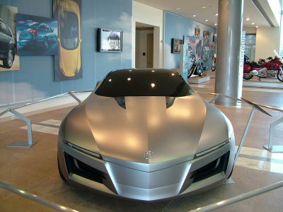
These pics actually do make the ASCC look a whole lot better. There is room for improvement and it could be something special had Honda played it right. The front shot is definately sweet.
The ASSC still looks like a next gen corvette to me.
LOL So many of us got ridiculed for saying the ASCC looked great in person when we saw it at the NAIAS:biggrin:
I think the initial shock that it was FR really turned people off from a car that is very nice in person.
I think the initial shock that it was FR really turned people off from a car that is very nice in person.
- Joined
- 31 January 2008
- Messages
- 276
LOL So many of us got ridiculed for saying the ASCC looked great in person when we saw it at the NAIAS:biggrin:
I think the initial shock that it was FR really turned people off from a car that is very nice in person.
It still reminds me of a futuristic Pontiac Firebird.
- Joined
- 4 October 2002
- Messages
- 569
The reason these pics look better is because they are close up where one gets to focus in on design details. Japanese designs typically do a good job on design details.
However, If one steps back and look at the vehicle as a whole entity, the design falls apart and proportions and theme elements are not inspiring.
This design belongs in the garbage can and it does look like a Pontiac Firebird.
However, If one steps back and look at the vehicle as a whole entity, the design falls apart and proportions and theme elements are not inspiring.
This design belongs in the garbage can and it does look like a Pontiac Firebird.
Similar threads
- Replies
- 0
- Views
- 82
