You are using an out of date browser. It may not display this or other websites correctly.
You should upgrade or use an alternative browser.
You should upgrade or use an alternative browser.
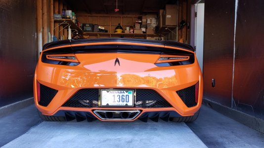
Finally arrived.
- Thread starter NFLPATS
- Start date
I must say, painting the blacked out portions of the front and back really do look sharp. I think its interesting that you painted the front surface and not the horizontal surfaces of the front wing-shaped section. Wondering if you considered painting the section under the "beak" as well?
To be honest, I was thinking about that at first but afraid it would be too much orange. Wanted to leave some black as an accent. I figured I see how it looks that way and paint the rest if I didn't like it. Easier to add then remove. I just didn't like the emptiness (all black) center of the front.
Wow...looking good...like what you did to the front!
So just to humor your imagination, here's what I think VP was thinking...
Original

Orange under the beak...

Now seeing it, it's starting to look a little busy again so probably a good move on your part leaving it alone.
What would be cool though to perhaps clean it up some would be to eliminate the creases in the lower half to make it look more integrated (i.e. cleaner)...

or another thought would be to integrate the paint matched beak into the hood...

or, since while we're at it

If anything...last pic looks flatter and wider and the proportions didn't change at all.
Photoshop's much cheaper than real body work :biggrin:
Last edited:
See that was my problem. I didn't have photoshop to give me an idea. I was thinking about the top beak being black but a vinyl wrap could take care of that. I originally told my paint guy to bring the orange so it meets the sides. He decided last minute to add a break between. Seeing it in person looks good (either way). Most importantly, I accomplished getting rid of all that empty black front end. I just wanted to be different...ala the modified emblem. Funny thing is that most people don't even notice what I did, they think it comes that way
Wow...looking good...like what you did to the front!
So just to humor your imagination, here's what I think VP was thinking...
Original

Orange under the beak...

Now seeing it, it's starting to look a little busy again so probably a good move on your part leaving it alone.
What would be cool though to perhaps clean it up some would be to eliminate the creases in the lower half to make it look more integrated (i.e. cleaner)...

or another thought would be to integrate the paint matched beak into the hood...

or, since while we're at itintegrate the beak into the hood AND remove the seams in the lower half for even LESS lines and a cleaner look?

If anything...last pic looks flatter and wider and the proportions didn't change at all.
Photoshop's much cheaper than real body work :biggrin:
The last chop looks pretty nice but the second chop has even more promise. The problem is that the black plastic under the "beak" was never designed to be painted the body color so the shape doesn't fit with the hood and doesn't flow very well from the lights down to the main central intake.
Basically if we are just going to tweak this design in order to simplify and lower, the think the answer may be to extend the shape of the leading edge of the hood in the last chop and lower it to the level of lower edge thereby eliminating the black plastic and lowering perceived front of the car.
You're right VP, I can see it now...

...even flatter and more lower (and wider) and aggressive lookin'
You're right VP, I can see it now...

...even flatter and more lower (and wider) and aggressive lookin'
Well Done Vf!
Yes more aggressive and much cleaner too!
It looks like its smiling an evil or menacing smile. Very exotic.
Now would I say it looks better than a more traditional front that does not have hanging headlights? Probably not. But I can say this is a unique and original design that serves its purpose well.
What is your favorite chop so far?
I feel like we are starting to derail from NFLPATS thread so I'll simply say any chop by anyone where a majority of car buffs would agree that they can see a prescient and clear visual relationship to its predecessor and that's pretty much it.
I feel like we are starting to derail from NFLPATS thread so I'll simply say any chop by anyone where a majority of car buffs would agree that they can see a prescient and clear visual relationship to its predecessor and that's pretty much it.
And I'd like to add that any of the photoshopped pics that are more than just a color change are a pipe dream. But since we have armchair automotive engineers in the house, let's see them do the design on a real car. I'm sure a little metal work is possible.
I'm saying I like his real life car colors. More so than the supposed shopped photos. Minimal aesthetic effort. The car looks good. The beak is less distracting.
I agree. The areas he painted make the front look much better.
[SUB][/SUB]
Hmm I kinda like that
Just painted my tailiight trim to match the car. Let me know what you think
Hmm I kinda like that
Bottom line, welcome to the family. These cars are just fantastic to look at as well as drive.
I could not wait to remove my Eibach lowering springs. The car looks great lowered but is a pain with respect to bumper rash avoidance. I would leave it alone. Unless of course you add the lift kit.My driveway sucks. I bought lowering springs but debating whether or not to install. It might be cutting it close. My Alfa is lowered and no issues
I might actually do that. Looks cleaner.
I just took a small hacksaw and cut the tips off the circle. It was easy. I bought an extra set just in case I messed up. The dollar store has the hacksaw with thin blade. I'm sure a dremel would work too
Similar threads
- Replies
- 15
- Views
- 592
- Replies
- 41
- Views
- 6K
- Replies
- 10
- Views
- 3K
- Replies
- 13
- Views
- 3K
- Locked
- Replies
- 8
- Views
- 4K


