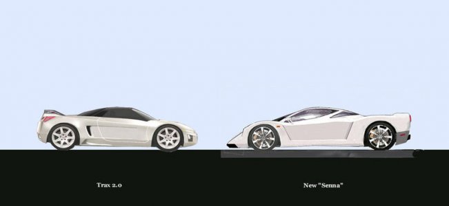
Ascc 2.0

Fix the front of the rear wheel well, and you have a very interesting design.
I don't know about shortening anything, may get to look like an eclipse:eek:
, but then again I am not a designer, what you have done looks Great.
 
It's not that we're so good--it's just that Honda screwed the pooch with that ASCC turd.
I can't believe that Honda has an entire team of $100K Ivy League degree designers and they can't come up with something better than the ASC. :rolleyes:
It is called bad management and leadership. I knew something was going to go wrong when they hired someone named Fukui, Fukme, or Fukit. Now the new slogan for Honda. "Honda-- We don't fulfill dreams. We just fuk em!"
or "Soichiro WHO? Fuk that too!"
Steve
 
Last edited:
Thanks for the imput, I'll try to have the revisions up sometime this weekend... midterms been KILLIN me lately, note much time to kill with photoshop im affraid...:cool:
 
Sorry that now looks more like a Toyota Celica, I prefer the clean Koeniggsegg style lines on the original presentation.

I like it way better then the clown shoe original (ASCC)!!!

here is a crude rendering of what I'd like to see changed...

I'm sure you can do a much better job then my ms paint job I did real quick...
shorter nose, lower hood, side intake,maybe add a rear spoiler, strech out the windows..
7751nsxx.jpg

nsxtb0.jpg


Did some minor revisions for the 2nd pic, and for the third followed the original NSX theme more for the die hard NSX fans on this board :biggrin:

favorite? futher improvements?
 
3rd one realy looks like NSX. great job!!!
 
looks like an enzo crossed with an audi r8. Not my taste. hey you asked!

Nice to see someone having a go though!

I'd look towards the gallardo design for further inspiration (i see a little there). :smile:
 
That 3rd pic looks fantastic. I wish you could send that to Honda somehow. I have an old school friend that works in auto design for Honda in CA now. I might try to find his contact info and send this to him.

- Kyle

P.S. That 3rd pic is now the background on my computer. Cheers.
 
3rd pic is a great step forward while keeping the character of the original NSX alive.....Steve
 
Very good.

Center the rear wheels in the well better. Make front and overhang rear slightly longer. Hey, how about we do an group design of the next gen NSX and send it to Acura?
 
Great job, but as far I as I love the original NSX design; which must be considered as a pure timeless masterpiece, this "third picture" looks too much like the original NSX and mixing two design styles is not, in this case, synergistic, IMVVVVVVVHO.

Of course, it is infinitely better than what Honda did!!! Congrats!

I also believe that there should be hints of first NSX design cues but without taking same design elements ( like the side vent and and door lines )

I still prefer Spooler's NSX II Senna ...

The NSX as all about long wheelbase layout ... not as much as the Jaguar XJ 220 !!!

Cheers!
 
I think the side windows need to be slightly larger for a realistic production car. Just bring them a little further down the doorline.

But it looks great! I agree it's mystifying that so many great designs can be whipped up on the internet in photoshop, but manufacturers with professional designers keep showing us turds.

1st rule of business - sell what the people want to buy, not what you think they need.
 
The really sad part is that Mr. traxtar614 did in a couple of days what Honda couldn't design in 10 years.:eek: :eek:

I have given up on Honda. The ASCC is a Joke. I don't care how much they revise it. Its a lost case. I have given up on Honda.:frown:
 
Yea the 3rd pic is great.... I think the design of the side intake and the lines down the door on the original NSX are part of the signature elements of the car....

Now if you can make the lines down the door parallel to the lines that go down the entire body ....and make the intake a bit more angular but not too much.... then it would be perfect..... does that make sense?:wink:
 
Back
Top