#AcuraNSXOnTour

It looks to me like NC1 is the chassis code for the new NSX. This would be consistent with the NA1/NA2, but they've skipped over the NB# (probably because this is the designation for the late 90s Miatas). The 4th/5th/5th digits are used as chassis codes for other American built Honda/Acura cars as well, typically following letter/letter/number:

-UB2 for the TLX (natural successor to the UA Vigor, 3.2TL, etc)
-CR3 for the current Honda Accord
-FB4 for the current generation of Honda Civic

Actually this is consistent with the Honda VINs from Japan too (e.g. KC1 for the current RLX/Legend), except that JH4 in the 1st/2nd/3rd position is replaced with a 'made in the USA' designation, in this case ~ 19U.
 
Last edited:
The pictures of the trunk are interesting in that it shows some of what appear to be access ports to the engine. Looks like maintenance with that silly engine cover will be a pain. They should either make a simple mesh grill like the JDM Type-R or leave it open like the recent Ferrari's.
 
The pictures of the trunk are interesting in that it shows some of what appear to be access ports to the engine. Looks like maintenance with that silly engine cover will be a pain. They should either make a simple mesh grill like the JDM Type-R or leave it open like the recent Ferrari's.

I thought it was already advised that the engine cover could be easily removed. Pretty much the same as the original NSX.
 
Quail-Motorsports-Gathering-014.jpg


Quail-Motorsports-Gathering-014a.jpg


Quail-Motorsports-Gathering-014c.jpg
 
The trunk..... WOW this is key for a Supercar. For it to be a DD it has got to fit my golf clubs. The question is will it fit two sets like my Cayman S does?
 
Love the wheels on the black car ^^ like the BBS on my Type S but simpler, bigger & more modern. Really don't like those on the blue above ^^.
 
Last edited:
Grrr ..

Those NSX pictures give more informations about its overall look and volume distribution.

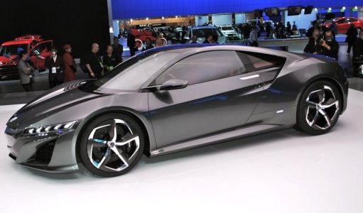
About the side view: TOO MUCH front overhang which is not reminescent of the classic rear midengine exotic sportscar.


It is IMO far from being elegant. As we pointed out repeatedly, the new NSX front end is in may ways WRONG and is suffering of a poor execution.


This front end is so WRONG that we could easily think that it is an ordinary front engine car ( which is partially true considering the twin electric motors ... ). Talk about ruining a promising design concept ...


Shame on you Honda ...


F ...ck, I do not want it to look like a scaled down Viper ...
 
Last edited:
Grrr ..

Those NSX pictures give more informations about its overall look and volume distribution.

About the side view: TOO MUCH front overhang which is not reminescent of the classic rear midengine exotic sportscar.


It is IMO far from being elegant. As we pointed out repeatedly, the new NSX front end is in may ways WRONG and is suffering of a poor execution.


This front end is so WRONG that we could easily think that it is an ordinary front engine car ( which is partially true considering the twin electric motors ... ). Talk about ruining a promising design concept ...

Hmm.. I didn't pay too much attention to these pictures, but you are right. :eek:

That side profile shot from that angle makes the front end of the car look quite long.
 
Hmm.. I didn't pay too much attention to these pictures, but you are right. :eek:

That side profile shot from that angle makes the front end of the car look quite long.

It's because of the short rear overhang. The original NSX has a long front and rear overhang.

- - - Updated - - -

F ...ck, I do not want it to look like a scaled down Viper ...

Then don't buy one lol. Move on. Honda has let you down for how many years now? If you think it looks like a Viper, etc. :rolleyes:
 
Last edited:
It's because of the short rear overhang. The original NSX has a long front and rear overhang.

N-Spec - I know you are a supporter of the new design and don't like to pick at it too much but I agree with Effer. Its strange to me because in general, front end designs have tended to either be focused on a short front overhang and end up compromising on the cowl height (e.g. Camaro or any BMW), or they go for a very low front and end up sacrificing the short overhang (e.g. 458 or LaFerrari). Very rare is the car that possesses both the short front overhang with the low cowl height (e.g. C7 Corvette or Lotus Elise). Unfortunately, the NSX seems to have neither the low cowl height or short front overhang!

Just for kicks, can you compare the overhang of the NSX to the 458 Italia to show us that it is not any longer or any taller? Not sure if you have enough information to do it but you usually work miracles with your modeling.
 
Last edited:
It's because of the short rear overhang. The original NSX has a long front and rear overhang.


Mega LOL. N Spec, did I already tell you that you are lame? Intellectually dishonest?


“Those who never retract their opinions love themselves more than they love truth.”
― Joseph Joubert


TERA LOL!

It has nothing to do with the rear short overhang. I am just talking about the front end, period. Look at a Lamborghini Diablo sideview ... Maybe you will very shortly begin to be about to soon start to understand . But I do not invest too much hope in this ... LO LOL


The NSX2 front end is WRONG, in lenght, in proportions and in execution.


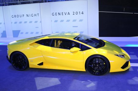
Short rear overhang? Just take a look at the sideview of a Lamborghini Huracán, despite an almost inexistant rear overhang, the front end is GOOD and makes no confusion about its rear midengine character.


Then don't buy one lol. Move on. Honda has let you down for how many years now? If you think it looks like a Viper, etc. :rolleyes:

Mind your own business coco!

It will be my own decision and I kindly remind you just to mind your own ... business please! LOL
 
It's because of the short rear overhang. The original NSX has a long front and rear overhang.

- - - Updated - - -

Hmm.. The 2013 NAIAS concept car had a much shorter front overhang.

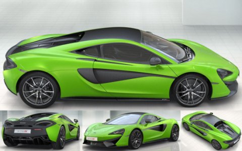
Exotic car these days have short front/rear overhangs, long front/rear overhangs are very 1980's.
 

Attachments

  • DSC_0275.jpg
    DSC_0275.jpg
    53.3 KB · Views: 43
  • McLaren-570S-Config.jpg
    McLaren-570S-Config.jpg
    57.9 KB · Views: 37
  • 2015-Lamborghini-Huracan-side.jpg
    2015-Lamborghini-Huracan-side.jpg
    58.8 KB · Views: 40
Just for kicks, can you compare the overhang of the NSX to the 458 Italia to show us that it is not any longer or any taller? Not sure if you have enough information to do it but you usually work miracles with your modeling.


Maybe they have the same or similar length or overhang, but this is where I want to emphasize the new NSX wrong proportions and faulty execution ...

When you look a the 458 Italia front end, it looks good and we instantaneously know that it is a rear midengine exotic sportscar ...
 
Maybe they have the same or similar length or overhang, but this is where I want to emphasize the new NSX wrong proportions and faulty execution ...

When you look a the 458 Italia front end, it looks good and we instantaneously know that it is a rear midengine exotic sportscar ...

Is this a viable solution, assuming it is is a lower, shorter front overhang? If not, what is it missing?

attachment.php
 

Attachments

Hmm..

Could it be possible that the illusion of the extra long nose be the the result of a wide angle lens or post processing?

From what I understand a wide angle lens will throw off the perspective depending on how close or how far an object is.

Update: Keep in mind that both the blue and black cars are not 90 degrees perpendicular to the camera, so a wide angle lens would not capture the cars "at the right scale/proportions".

 
Last edited:
Is this a viable solution, assuming it is is a lower, shorter front overhang? If not, what is it missing?

attachment.php


Your drawing is interesting. Less busy than what we see on actual car which is also good from the front perspective. The problem lies in its volume ( not your solution but Honda's one ... ), its overall shape and the multiple textures ( grilles, infamous beak albeit degenerated, hood height, ... )

Picture showing the white NSX2 concept: front looks wider and lower proving the design to be interesting.

Picture showing the red NSX2: the front overhang seems to be way much less ... ( like 2slow2speed pointed out: wide angle distortion? ( which I doubt ... but maybe ... ))

Picture showing frontview of both NSX1 and NSX2: putting in evidence that frontview is not bad ...

NSX2 Proto.jpg
La-nouvelle-Acura-NSX.jpg
NSX1 et NSX2.jpg


My solution would be to exploit Honda's idea ( or Valkyrie Pilot's one ) keeping in mind to reduce front overhang, to accentuate the wedge aspect and in the goal to counteract the hood height regulations, like Ferrari and Lamborghini do, create big front vents reducing the body volume. By front vents I mean deep ones giving the illusion of having less body and creating sharper, thinner and more aggressive nose.


Putting grilles almost flush with front boby panels doesn't fool anybody ( except maybe N Spec* ) and doesn't do Ferrari and Lamborghini's tricks ...


*What is the difference between N Spec and God?

God does not pretend to be N Spec.
 
...the new NSX front end is in many ways WRONG and is suffering of a poor execution. This front end is so WRONG that we could easily think that it is an ordinary front engine car...

I agree. Personally I think if they got the front right, I could easily overlook ALL the other complaints and criticisms that are popping up and be a HUGE fan of the new NSX. In these shots from the #tour , when you couldn't see the front, the design looked so promising...

so_promising.png


But once the veil was removed, it really does look more like an ordinary front engine car (w/its hung headlights) and you're left deflated with a sigh. If only the face paid better homage to the original (any of the below random examples do a better job imo), honestly I wouldn't care as much about the final power output, the interior, final weight, 0-60 times, etc. (that's just me)...since it's still going to be an amazing vehicle for the $ (remember folks, it's still a Honda). BUT since they got the face incorrect imo, I think it makes it easier to not like other stuff too.

face_comparo.png

Great point, VF. It is quite surprising how great the NSX design looks when the front is covered. The headlights and front strakes do not seem to be the problem and actually look great IMO as long as the center section is hidden.

Regarding the above 4 cars, their fronts are good and do not offend at all but are very standard for the most part and shout "me too" (except for the Aston Martin). The lights are about the only unique thing. However, to your point VF, what they have going for them that the NSX does not is 3 crucial things: Very low, Low Mass (as effer so astutely pointed out), and Simple Design.

Ted, please tune in and stand up to the corporate designers!

- - - Updated - - -

Your drawing is interesting. Less busy than what we see on actual car which is also good from the front perspective. The problem lies in its volume ( not your solution but Honda's one ... ), its overall shape and the multiple textures ( grilles, infamous beak albeit degenerated, hood height, ... )

Picture showing the white NSX2 concept: front looks wider and lower proving the design to be interesting.

Picture showing the red NSX2: the front overhang seems to be way much less ... ( like 2slow2speed pointed out: wide angle distortion? ( which I doubt ... but maybe ... ))

Picture showing frontview of both NSX1 and NSX2: putting in evidence that frontview is not bad ...

attachment.php

attachment.php

attachment.php


My solution would be to exploit Honda's idea ( or Valkyrie Pilot's one ) keeping in mind to reduce front overhang, to accentuate the wedge aspect and in the goal to counteract the hood height regulations, like Ferrari and Lamborghini do, create big front vents reducing the body volume. By front vents I mean deep ones giving the illusion of having less body and creating sharper, thinner and more aggressive nose.

As I stated above, you make a great point effer. The current trend is toward deep vents (e.g. LaFerrari, Corvette, Huracan). The hex grill is so 90's and contributes to the heavy feel of the front.

So do the hanging lights need to go as well or do they make it interesting? The 991 911 has hanging lights so they definitely seem to be hip these days.

- - - Updated - - -

hmmm...i dunno, i keep squinting at this pic and it seems to change before my very eyes :rolleyes:
difference_game.png

That's funny VF. It hurts but its funny. How you computer design gurus do that, I don't think I will ever understand. And it seems so effortless.
 
Last edited:
I agree. Personally I think if they got the front right, I could easily overlook ALL the other complaints and criticisms that are popping up and be a HUGE fan of the new NSX. In these shots from the #tour , when you couldn't see the front, the design looked so promising...

so_promising.png


But once the veil was removed, it really does look more like an ordinary front engine car (w/its hung headlights) and you're left deflated with a sigh. If only the face paid better homage to the original (any of the below random examples do a better job imo), honestly I wouldn't care as much about the final power output, the interior, final weight, 0-60 times, etc. (that's just me)...since it's still going to be an amazing vehicle for the $ (remember folks, it's still a Honda). BUT since they got the face incorrect imo, I think it makes it easier to not like other stuff too.

face_comparo.png

what car is that on the top right out of the 4 pictures?
 
what car is that on the top right out of the 4 pictures?

That is a McLaren MP4-12C equipped with a swiss-tuner body kit made by FAB Designs. It was unveiled at a Geneva Auto Show not too long ago but at least 2-3 yrs. That particular show had a few body kits for the MP4 made by Mansory and Gemballa but the Fab kit is the most fitting imo.

mp4-12c_1.png

mp4-12c_2.png

mp4-12c_3.png

mp4-12c_4.png

mp4-12c_5.png

mp4-12c_6.png

mp4-12c_7.png

mp4-12c_8.png

mp4-12c_9.png
 
Back
Top