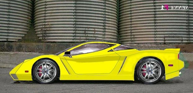
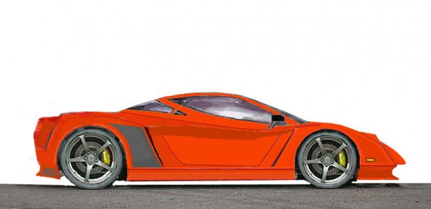
Senna F1R

Joined
14 February 2002
Messages
495
Location
Los Angeles, CA
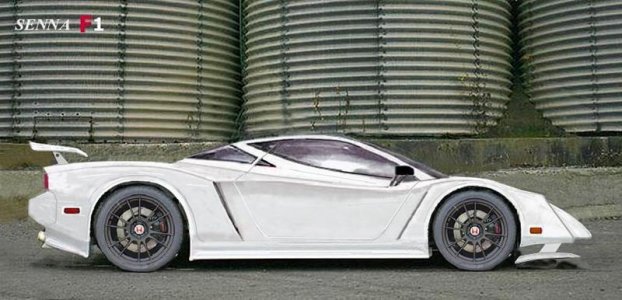
Here's another try with F1 beak and front wing spoiler that retracts upward for street use:biggrin:

Note: integrated door handle completes rear glass shape.

new wing.

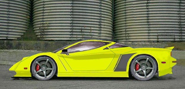
Finally got a door shape figured out.

Not done .

Any opinions?..good or bad..got to get my post count up::redface:
 

Attachments

  • x2.jpg
    x2.jpg
    59.9 KB · Views: 603
  • yel4.jpg
    yel4.jpg
    72 KB · Views: 227
Last edited:
Well, since you ask for opinion.... Is this some thing you like to see a car manufacture (Honda) to built, or exercising your artistic ability?

To view it from pure design point of view, as a potential production car...

The front lower spoiler will never work; the slightly raised F1 style nose to accommodate the spoiler will most likely not meet the Federal crash regulation; so is the height of the front bumper. The rear bumper probably needs to go since we are about to enter 2008 (Even Honda delete the "stick out" rear bumper with the HSC). If the raise nose could be made to pass the Federal crash test, you may face aero issues since that is mainly design for open wheel cars. Also, the front wing is at an wrong angle to push the car up instead of down? I'm not an aerodynamicist, but I assume if it is usable, Ferrari or McLaren would have done it.

By measuring the drawing, the wheelbase seems to be a little long (You can put add measurement to the drawing so people know what you're intend is). Also the tail end after the rear wheels is also little long. Do you intend to have the trunk in the front or rear?

The lines on the door suggest the famous Lambo Scissor door design, which Honda will never accept. And it could also be a safty issue if the car flips. The rear hatch glass probably shouldn't cut into the door, or vise versa, unless cut-over is going to be painted black to match the line, but it is kinda weird to have it like that if the windows are not tinted. There is absolutely no reason to have a divider between the door glass and rear hatch, which leads to lack of visibility from the side windows. The side mirrors probably should angle towards the other way to avoid aerodynamic drag and wind noise issues.

The rear spoiler made it a little ricy, which in term, made this design more of a NSX with a wide body kit than an actual possible production car. In my opinion, the drawing is very beautiful (Under my reasoning if used as a concept car), but the spoiler is kinda out of place.

And need side skirts.


However, as a concept car, it is a beautiful design. It does have a Zonda and HSC flare to it, which is welcome. It will make a very cool car in Grand Tourismo or a futuristic movie.

This are my sincere opion since you ask for it. If the intend is to be a production car, you can easily make this drawing more realistic.

Nice job.

attachment.php

pagani-zonda-r.jpg

Honda%20Concept%20HSC.jpg
 
Last edited:
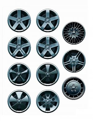
Wheelie nice!
 

Attachments

  • wheelsa1.jpg
    wheelsa1.jpg
    76.5 KB · Views: 89
Good review Vance,

Although these are mostly artistic, some of the shapes that can be achieved doodling look intersting to me and I post um here cause I wouldn't know who else to show them to that could crtique them as well. Plus, although it's silly to think so, I'm hoping Honda is looking at some of these just for Idea's.


To address some of your comments.....

Front Bumper...since they are concepts,a bit of imagination must be used to interprit them . I was actually tring to make a semi-street F1 front end.

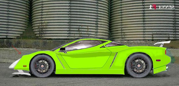
In the pic of green car, red arrow shows where actual impact point would be (at least as high as original). Of Course the nose would break off, but that could be Plastic piece and cheap to replace..... But not pratical..See solo Yellow Redesigned front and added integrated rear wing.

Rear Bumper....To me, The NSX is all about Long and Low and a protruding rear bumber adds much to this.. helping to balance the look front to rear.
Flat ass may be fashionable these days but for me it just kills the profile everytime I attempt one. Plus, I want the protection.

Wheelbase...In the comparo, you can see the original car used for rendering.
The base is identical to original NSX. What makes it look longer is that..The HSC canopy layered in is a bit to small (adjusted) and fenders really tight to wheels as well as other dimensions being off I'm sure. Take me many hours to get it perfect.

Door...Not meant to be a Lambo style..standard opening. The position of the lines dictated themselves..Sorry you didn't like door handle but I had to terminate rear window at door..seemed like a logical place to continue window line.

These are a lot of fun especially when you can make people understand what you are tring to show.

Thanx for comments..makes it worthwhile.

pics
 

Attachments

  • green 1.jpg
    green 1.jpg
    70.6 KB · Views: 106
  • hh1.jpg
    hh1.jpg
    39.6 KB · Views: 100
  • yel 1 b.jpg
    yel 1 b.jpg
    61.8 KB · Views: 83
  • hs1.jpg
    hs1.jpg
    44.4 KB · Views: 128
Last edited:
I really like it! I think the front splitter and bumper needs to be reworked to look less like the Zonda. Though I feel the design really captures the "look"
of the original NSX
John
 
I really like it! I think the front splitter and bumper needs to be reworked to look less like the Zonda. Though I feel the design really captures the "look"
of the original NSX
John


Thx,

I also hope that if a new model is made, that it will be unmistakably NSX.

Zonda is wicked. Many incredible cars these days. I sure do wonder what Honda's going to eventually do?

spooler
 
Deleted messaged and moved to respect OP decision.
 
Last edited:
Raven...

Your drawings look OK although the presentation is horrible (pecil on line paper scan lol) but why did you bother posting the 3D images?

They are so basic and incomplete that there is nothing to discuss.

Next time...

Why not semi-finish your drawings first and then... maybe think about giving the OP a little respect before you just Take Over ( I worked hard on these) or..perhaps ..start your own thread?

spooler

Sorry about that didn't think you take it soo personal, it just seemed kind of cool that someone else beside me had some designs cool ideas in mind and yeah my presentation was crappy for the pencil drawing sketch on lined paper lol...and the reason I posted the 3D Models were to remind people of my old ideas and some changes I made to the new one in the sketch. Maybe I'll start another threat but I thought it would be nice to share it in a like common thread with you. Again sorry for hurting you it seems like your pretty upset. I deleted my post if it make you happy and I'll just put it in the off topic.
 
Back
Top