Request For Help From Photoshop Pros

Joined
4 June 2002
Messages
776
Location
Chicago, IL, USA
Heys Guys,

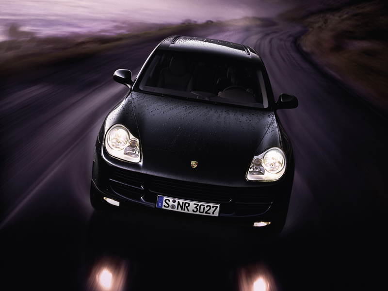
Working on preparing a PowerPoint presentation on SUVs. We wanted to use the graphic below as the background for every slide (the idea being to use white text against this dark background).

Currently, I think this background stands out too much and will draw away from the text on the page (especially those headlights and the license plate!!).

Wanted to ask, then, if you Photoshop pros could manipulate this image (keeping size dimensions approximately the same) so as to make it more muted, and suitable for a PowerPoint presentation background.

I personally think the only thing that really needs to be done are to subtlely reduce the intensity on the headlights and license area, but I am open to creative input.

Any and all help would be sincerely appreciated. Thanks guys (Neo, where you at!!).

Regards.
Cayenne%201%20--%20800.jpg
 
Originally posted by FuryNSX:
Wow, great job. Looks good. But I'd also knock that badge off the front. It looks hideous on an SUV!
wink.gif


-Randy

Many other's (including myself, from a purely emotional standpoint!) have argued that it is the SUV that actually looks hideous on the badge.
wink.gif


Regards.
 
Hey NSXaholic, now what made you think of me?
wink.gif


Here's my version... <A HREF="http://www.optusnet.com.au/~mike.m/cayenne1_800_adjusted.jpg">PORSCHE Cayenne : Adjusted</A>

I have removed the plate (very distracting),dulled all the lights, and adjusted the intensity levels of highlights along the edge of the car. The porsche's badge is dull too (pun intended). The overall picture color/brightness/contrast remains in intact.

If it's still too intense, email me (chk my profile); i can adjust it further for you.

tip: the lighter stop in the topleft is wellsuited for headers.


To what address do we send our invoices?
biggrin.gif


<FONT SIZE=1>


[This message has been edited by NeoNSX (edited 11 March 2003).]
 
Neo,

What do mean!
wink.gif
You are always a great poster to Prime.

The picture looks great!! Very similar to what MAJOR STONER was kind enough to do -- have you checked his out. Great minds think alike, huh!!

MAJOR STONER's version is slightly darker, and I'm thinking a muted background like this might work a tad bit better since the idea is really to have a silhouette of the vehicle, so as not to detract from the overall text on the page.

Could do you think you might darken it a couple of shades (maybe even a shade or two darker than MAJOR STONER has it) so I can gaugue the suitability. Also, any way the headlights can be muted even more -- I still think they are a bit bright?

Thanks for the time you've taken to do this. Much appreciated !!

Regards.

[This message has been edited by NSXaholic (edited 12 March 2003).]
 
JONATHAN, I like!! Thanks much!!

Just for kicks, can one of you guys darken the picture even more, so the just the silhouette remains.

Also, I've just managed to load Photoshop 7.0, but am a complete novice. If there is quick way to "tint" the picture, could you guys let me know, so that I don't have to keep pestering you (ie, where can I find the option that controls this??)

Regards.

[This message has been edited by NSXaholic (edited 12 March 2003).]
 
For simple adjustments try going to:

Image
Adjustments
Brightness/Contrast

On the original one I did I layered the headlights and other elements to offset them separately.

Here is one more that is a bit more tweaked to see if it suits your needs more:

Cayenne_BG_Darker.jpg
 
I have two new versions i'd like to post... i think you should seriously replacing the above shots with one of these consider these.
biggrin.gif


cayenne_black.jpg

dark enough?
wink.gif


cayenne_mynsx.jpg

WHO'S YOUR DADDY!!!
biggrin.gif

<FONT SIZE=1>

[This message has been edited by NeoNSX (edited 12 March 2003).]
 
Many thanks to all who have posted. These are all excellent adaptations of the original, and I will have a difficult time selecting the best background for my slide show presentation.

I appreciate all of your assistance, and thank you guys for the time and effort that undoubtedly went into producing them.

A special thanks to Neo, who went above and beyond the call of duty and privated me a number of different iterations, each with slightly different modifications. Really appreciated!!

Yet another reflection of what a wonderful and terrific community Prime is.

Regards.
 
Back
Top