You are using an out of date browser. It may not display this or other websites correctly.
You should upgrade or use an alternative browser.
You should upgrade or use an alternative browser.
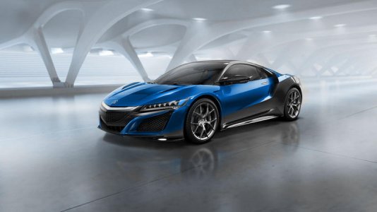
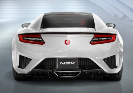
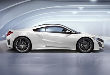
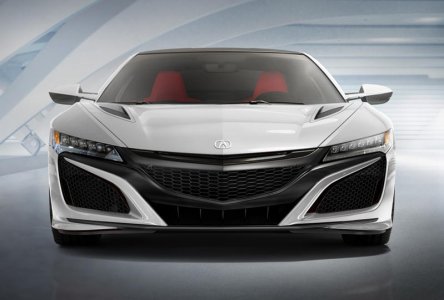
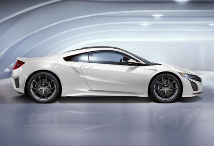
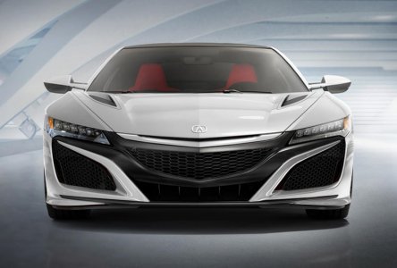
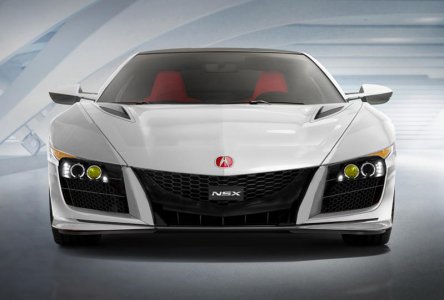
New NSX in Different colors
- Thread starter Moisted
- Start date
Thanks!
Car looks great in every color!
Car looks great in every color!
Some photoshopping... (sorry, white is a bitch to do)
View attachment 119794
View attachment 119795
View attachment 119796
View attachment 119797
View attachment 119798
View attachment 119799
View attachment 119804
View attachment 119801
View attachment 119802
View attachment 119803
What happened to Gray?
Although there is no place to vote for the Pearl white, that's my vote
:biggrin:
:biggrin:
I think that purple is too vibrant for any votes =/ can it be closer to the Midnight Pearl available for the second gen? This car should be considered closer to the McLaren 650s which also sported the color, but the purple in this pic is fitting for a Kia Soul.
....Car looks great in every color!
I agree, but Black is the Bomb! (I admit I'm biased :wink
Attachments
Yea sorry I messed up. Missed white and gray, and now I can't change the option list ... I was too excited to get my vote in for Blue... :wink:
- - - Updated - - -
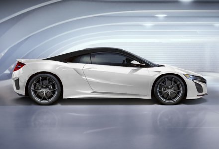
What about black top and sides...
View attachment 119806
butchered?...
Prefer lower body color contrast than halfway blending...It looks unfinished.
White... O yea!
Yep, championship white looks great.
What about a Formula Red (R77)?
Agreed. Would also like to see something like Urban Titanium Metallic.
Hmm, better but still hopeless :biggrin:
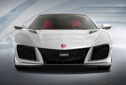
The completely overstyled intakes and headlights destroy it for me.
It looks like a toy designed by a toy like mind..or a shoe lol.
Seriously, I hope some of you guys get um and that they kick ass.
You have some serious talent...THX!
White for sure!
Any chance getting one of the side profiles with a black top?
Any chance getting one of the side profiles with a black top?
Imola?
hate it but happy many like it...:biggrin:
It will be quick.
here wht rear
gorgeous!
sucks but here...:biggrin:
The white grill piece helps give illusion that the hood slopes down more as it should have, but sucs.
The black top does not effect me like original.
Last is a chop that still sucs but that I would have found more acceptable.
thx for comps
S
The white grill piece helps give illusion that the hood slopes down more as it should have, but sucs.
The black top does not effect me like original.
Last is a chop that still sucs but that I would have found more acceptable.
thx for comps
S
Attachments
Last edited:
sucks but here...:biggrin:
The white grill piece helps give illusion that the hood slopes down more as it should have, but sucs.
The black top does not effect me like original.
Last is a chop that still sucs but that I would have found more acceptable (no headlamps atm)
thx for comps
S
Looks awesome. Thanks for the quick work. I've been a big a fan of the black top and white combo. I'm slightly biased lol.
It'll be hard to pull off with the flying buttress obtruding from the roofline, but I predict this type of wrap will be popular. The look gives the illusion of a slimmer/lower car thanks to the black roof.
Thanx Spec ,
exactly, I just guessed where it might begin or end .
Similar threads
- Replies
- 2
- Views
- 392
- Replies
- 11
- Views
- 376
- Replies
- 0
- Views
- 82
- Replies
- 8
- Views
- 1K
