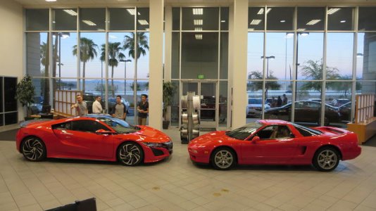
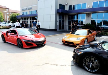
So the prototypes have been roaming the roads and some people have taken great pics of it and some have not. I've heard people describe the car as fat, stubby, etc. Now people are saying nose is too long, etc. The dimensions have been released and the values are far from being huge or larger like some would suggest. Regardless, people have only been spectating from videos/pictures and they don't have a very clear view, especially on this forum when they have so much riding on the first gen and naturally expect so much out of the second gen. I just wanted to post this to inform those on proper viewership experience of a car given their larger scale and say don't let the taper arrow aesthetics of the new NSX fool you.
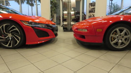
Our first gen NSX does not photograph well upclose like most cars and looks much better when the photo is shot from afar. See how the top pic is unflattering and the NSX looks kind of wimpy, with no sign of the prominent dragon tail. You can see how there is less distortion as you step further away to snap a pic. Try it on your cars please from the same angle. The same can be said about the new NSX:

Now, obviously there are limited 92 NSX stock photos to choose from for consistency purpose. For the new NSX is the same 2016 model that was unveiled this year, some people believe the proportions of the NSX have been undergoing huge changes as many amateur photos arise. The designers have already stated that the production car will not change drastically from the 2012 concept. Aside from the larger intake and longer spoiler, the NSX has kept the same overhang and cockpit proportions in spirit of the design. It has received subtle refinements, but the only thing really radical is the interior. So there is no longer nose. It's due to perspective.
The new NSX always had a long, sharp nose. The tapered arrow shape just gives the illusion of short overhangs from upclose perspective. Very much like a person looking less flattering in a "selfie" versus a good portrait shot.
Anyways, I've embed a video demonstrating the phenomenon. Look at the series of pictures above of the red NSX and then look at what occurs in the video. I'm not calling anyone a fool because they were tricked by photos. Don't take it personally. It's hard to gauge a car from a picture versus in person. Either way, I can't speak for how the new NSX will perform. All I can speak for is what it actually looks like. They seem to be still perfecting the tech given the 10 year hiatus from the last production NSX.
<iframe width="560" height="315" src="https://www.youtube.com/embed/VfG-U7T06H8" frameborder="0" allowfullscreen></iframe>
Keep in mind, I'm trying to demonstrate reality through a LCD or LED screen via a computer simulation. So try to wrap your heads around that
- - - Updated - - -
Watch the first few minutes of the video. Then go try it out on your own cars. It helps if your smartphone has a zoom feature. It's perspective. Plain and simple. I really made the video for the people who have been fixated on the front end, but I figured I'd share with the forum as a whole. I'm not disagreeing with the thought that the frontend needs to be simplified, but that's already been discussed and I can settle for "room for improvement."
Our first gen NSX does not photograph well upclose like most cars and looks much better when the photo is shot from afar. See how the top pic is unflattering and the NSX looks kind of wimpy, with no sign of the prominent dragon tail. You can see how there is less distortion as you step further away to snap a pic. Try it on your cars please from the same angle. The same can be said about the new NSX:

Now, obviously there are limited 92 NSX stock photos to choose from for consistency purpose. For the new NSX is the same 2016 model that was unveiled this year, some people believe the proportions of the NSX have been undergoing huge changes as many amateur photos arise. The designers have already stated that the production car will not change drastically from the 2012 concept. Aside from the larger intake and longer spoiler, the NSX has kept the same overhang and cockpit proportions in spirit of the design. It has received subtle refinements, but the only thing really radical is the interior. So there is no longer nose. It's due to perspective.
The new NSX always had a long, sharp nose. The tapered arrow shape just gives the illusion of short overhangs from upclose perspective. Very much like a person looking less flattering in a "selfie" versus a good portrait shot.
Anyways, I've embed a video demonstrating the phenomenon. Look at the series of pictures above of the red NSX and then look at what occurs in the video. I'm not calling anyone a fool because they were tricked by photos. Don't take it personally. It's hard to gauge a car from a picture versus in person. Either way, I can't speak for how the new NSX will perform. All I can speak for is what it actually looks like. They seem to be still perfecting the tech given the 10 year hiatus from the last production NSX.
<iframe width="560" height="315" src="https://www.youtube.com/embed/VfG-U7T06H8" frameborder="0" allowfullscreen></iframe>
Keep in mind, I'm trying to demonstrate reality through a LCD or LED screen via a computer simulation. So try to wrap your heads around that
- - - Updated - - -
The question is:
are these NSX having a bigger and longer front end or is it a picture distortion as pointed out by 2slow2speed?
I tend to actually believe that these pictures are not enough distorted to explain all the extra nose length ... ( Why? Look at the front wheels and the stage ... )
When we compare these two different NSX, nose of prototype seems to be shorter when you look at the centre grille section compared to the rolling pre production example showed on the second picture. It is subtle ... I am not sure, picture angles are different ...
I think it has less to do with lens distortion and more to do with the angle of the shot and the design of the front. Because the design of the front has it angled as it approaches the center grill it appears to look bigger when you from a three quarter perspective. Conversely when the car is viewed from a slight rear perspective the front overhang looks very small. This is also true of the design of the rear which looks nice and long when viewed from a slight rear perspective but looks very short when viewed from a slight forward perspective
Watch the first few minutes of the video. Then go try it out on your own cars. It helps if your smartphone has a zoom feature. It's perspective. Plain and simple. I really made the video for the people who have been fixated on the front end, but I figured I'd share with the forum as a whole. I'm not disagreeing with the thought that the frontend needs to be simplified, but that's already been discussed and I can settle for "room for improvement."
Last edited:


