My impression of the HSC
I want to share my impression of the HSC for those of you who have still only seen it in photos. Please note these are my own opinions, so you may disagree with me.

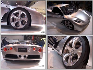
The HSC looks better in real life than it does in photos. It's wide, very low and compact. It looks like an exotic supercar and looks expensive.
<B>FRONT:</B>
I'd have to agree with <B>NSXclubOfAustralia</b> who said in a conversation that "the front shows the NSX heritage". It looks great. This is the kind of cosmetic upgrade Honda should have given the NSX a couple of years ago.
<B>ENGINE-TO-REAR:</B>
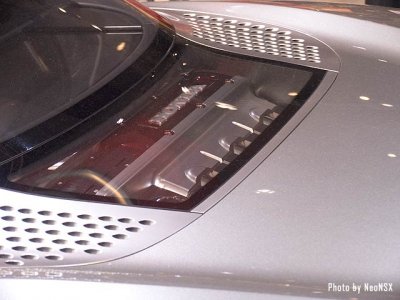
From the engine-bay to the rear there are problems. I went to the show hating the rear-end from the photos I've seen, and while it looks better in real life, it's too chunky and rigid - which goes against the smooth curves of the front. You can see the shape is trying to 'steal' from the Gallardo's design (which is awesome)... but the rear doesn't join up with the cockpit as nicely as the Gallardo. I personally would love to see an integrated spoiler to carry the "NSX heritage" onto the rear, and the back of the cockpit flattened out.
<B>REAR-END:</B>
Still talking about the rear, the tailights are crap. I know some of you on prime love the circular brakelights, but i don't. And seeing them in person hasn't helped. Let me explain why:
When the '02 NSX was released, i disliked the new headlight design... but progressively overtime I've come to like them. Despite time to accept the rear, I still dislike it. It hasn't grown on me.
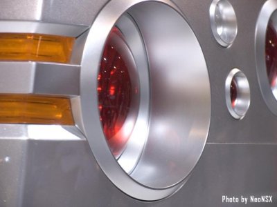
I believe these circular tail-lights will make the HSC look dated in a few years. If you check out the attached photo close-up below, you can see from a side angle the light concaves (?) outward. I do like the fact it has LED's... that's very cool at the moment. But it looks almost as if Honda cannot make up their mind whether to use conventional brakelights or LED's.
The circular brakelights also conflict with the square indicators, and the tiny reversing lights just make it all too busy. It's like a 3yr old's shape learning jigsaw puzzle; squares and circles everywhere.

Or if you want a shorter reason to hate circular tail-lights.... they look like a vette.


j/k
Honda makes their cars simple in design. The rear-end of the HSC seems to go contray that philosophy.
Lastly about the rear, the twin centered exhausts are very large and sort of unique... but there's a few problems I can see from this configuration: 1) the HSC will constantly have a dirty butt. Every time you drive it, it will leave a mess.

2) it will probably be a bugger to add any custom exhausts, 3) dual exhausts on the sides makes the car LOOK wider and IMHO more aggressive. It also makes it look less like a Boxster.

I did love the excess use of mesh and the underbody wind blades (?).

<B>SIDES:</B>
I would love to see the side-intakes enlarged vertically; afterall, more air flow = more horsepower, right?

I didn't see any way of opening the doors; no obvious handles. I would miss the little "NSX" badge on the door latch... that was a really cool minor detail to the NSX.

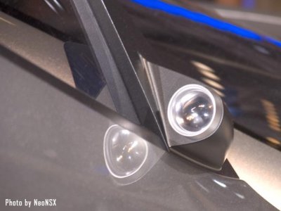
The gull wing doors are pretty funky. Yet another Lambo idea Honda has borrowed here (which is okay by me) As we all know there's no side mirrors, but small video camera's. (See close-up photo) They look discreet, although I couldn't see where the video would be displayed inside the cockpit.
<B>COCKPIT:</B>
The Interior looked incomplete in design. Not bad, just incomplete. The pedals looked to be made out of cheap construction steel, and the speedo/tacho looked old fashioned. The interior was trying to look futuristic... which is cool in autoShow's... not sure about longterm though.
The 'Start' button was S2000-like and that's cool.
<B>WHEELS:</B>
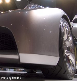
Awesome. They are noticably HUGE in real life and there isn't a huge gap like the NSX.

Overall the HSC is extremely low. It looks lowered which will save many of you guys the job.

<B>HEADLIGHTS:</B>
Front on, the headlights look awesome. Very very aggressive. There is one problem though -- part of the light pertrudes out of the housing. Now some people will like this -- i did not. From some angles it looks stupid: like the headlights have a bubble defect. It also reminded me of the headlights on a Celica and that's a bad thing if the HSC wants to be an exotic.
Lambo and Ferrari aren't doing this... so I'm not sure why Honda would want to copy Toyota.

However, a cool idea I had (Honda, if you're reading this) would be to make these clear headlights visible during the day and pop-up slightly when in use. A kind of clear-housed pop-up light. It would be like the old NSX and very original (but not too obvious it's a pop-up which is out of fashion)
<B>Some after-thoughts:</B>
The HSC was definitely an attention-getter at the show. There were constantly crowds of people standing around looking and taking photos (I was there during a quiet period too). So that's a good sign.
I still think the rear end needs work. This car is 90 cents in the dollar off becoming a timeless machine of AWE. All it needs are a few design changes and plenty of HP's to compete with the 430 and 911. Slap on a reasonable price-tag, and it <B>will</B> sell.
If Honda releases the HSC exactly as it is, I'd be concerned it will look dated in a few years. This is mainly due to the tail-lights & exhaust.
Lastly, the HSC also appears on the surface to be difficult to modify. There's not much room above the engine, there's the central exhausts, and some of the paneling could make it hard to mod (but certainly not impossible

). That's a shame. That's one of the beauties of Japanese cars -- they often lend themselves to being modded. Honda should cater for that.
If you've read this far, thanks for reading. I trust you've found this informative. I hope Honda ships the HSC over to the USA sometime so you guys can check it out for yourself.
 Here's a sneek preview: