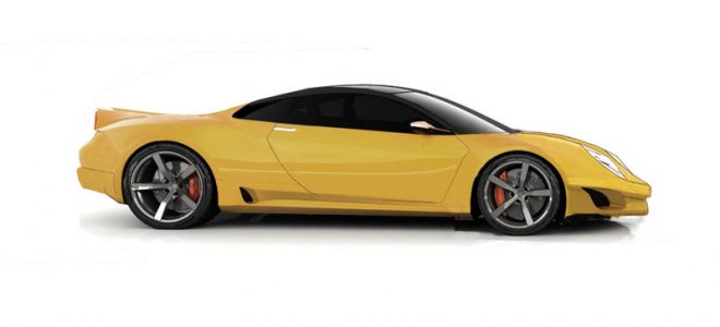
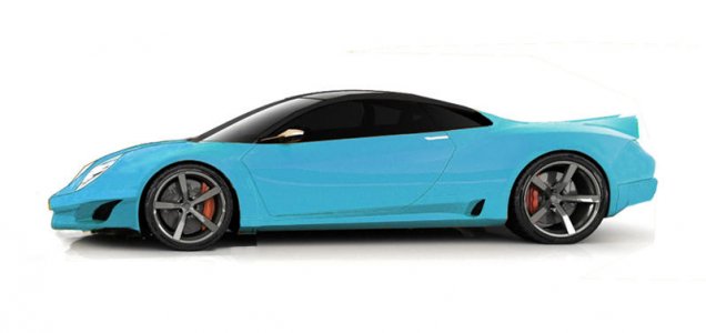
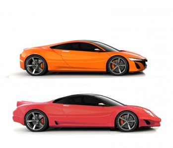
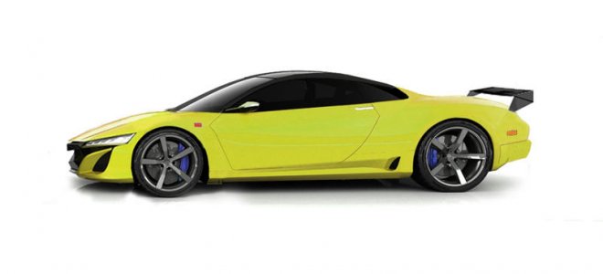
Another revision of Na 3

Joined
14 February 2002
Messages
495
Location
Los Angeles, CA
Like many, I am totally dissatisfied with the new design...

and the Engine and extra motors lol...silly

All we needed was a sweet, perfectly balanced V-8.

The original design is one of the most beautiful cars in the world..no reason to sway so far off.
IMO, it must be similar.

Here..heavily revised using one of N-specs fine renderings as a starting point.

S
 

Attachments

  • na 3 spooler 4.jpg
    na 3 spooler 4.jpg
    25.5 KB · Views: 218
  • Na 3 DR blu.jpg
    Na 3 DR blu.jpg
    28.1 KB · Views: 212
  • comparo 1.jpg
    comparo 1.jpg
    49 KB · Views: 230
Last edited:
whats up with the headlights? Looks like some kind of porsche
 
whats up with the headlights? Looks like some kind of porsche

thx,

The reason the headlights are there is because: IMO,that's where they belong.

I think some design studio's get completely carried away with trying to be different, creating extreme shapes that end up looking odd and out of proportion.

That's what I so love about the original..It's such a "smart" design

Put things where they are supposed to be and chances are you will end up with something nice to look at for a long time.

That said ,I was semi-expecting this and can see the similarities but i did draw it freehand and it seemed to make the most sense... will adjust along with wheelbase..not quite finished and may never be lol.

As for resembling a "fish" .... Ok thanx

S
 
Last edited:
Don't take this the wrong way, but may be you should go Porsche instead? I would say many own the NSX because they would rather not go with typical Porsche.
 
Like many, I am totally dissatisfied with the new design...

and the Engine and extra motors lol...silly

All we needed was a sweet, perfectly balanced V-8.

The original design is one of the most beautiful cars in the world..no reason to sway so far off.
IMO, it must be similar.

Here..heavily revised using one of N-specs fine renderings as a starting point.

S

These are GOOD!

Why the hell don't you fly to Japan & show them how it's done. Seriously, YOU should be working for Honda!

This looks A LOT better than the Audi R8/Camaro love-child they are proposing...

(ditch the fixed head lights...not a fan of those ever since Honda stole the Misterbitchy 3000GT lights for the 2002 NSX..."retro-look" is "in", so go pop-ups!)


.
 
Last edited:
I agree, his designs are ALL Porsche inspired... he would do well on the Porsche boards...umm but not here

Porsche? His designs look NOTHING like a VW Beetle on steroids!
(like EVERY 911 does...they're called "P-Bugs" for a good reason, ya know!)

...and I told him to ditch the fixed headlights...


.
 
Last edited:
Sorry, but the NSX concept looks way better than your design. Headlights just look really odd and out of place. And nose seems to slope down too abruptly, as if something heavy sat on the bumper.
 
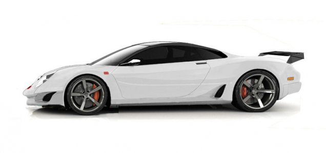
Thanx for comments GBL1..I thought the wht R addressed the problem with the nose...(reccesed louvers but it's hard to tell from the side) below is with current NA3 concept nose for a look.

S
 

Attachments

  • na 3  8.jpg
    na 3 8.jpg
    25.3 KB · Views: 60
Last edited:
IMHO you are concentrating on the wrong end. Go back and redo the front, it is disproportionately too short and slopes down too sharply with reference to your design of the rear from the back window to the rear bumper.
 
IMHO you are concentrating on the wrong end. Go back and redo the front, it is disproportionately too short and slopes down too sharply with reference to your design of the rear from the back window to the rear bumper.

Thx,

Finished..

I'm was not trying to design the complete car.

The main purpose of this exercise was to stretch it out a little, with closer ties to the original design.

S
 
Last edited:
Back
Top